De

Jonny Niesche staring at the sky (munich)

Editions
Jonny niesche well munich frame front

Jonny Niesche, well (munich), 2024 (framed)

Silkscreen print, ceramic pigment burned on glass, silver paint
Mounted as free-floating on the wall (matte Aluminium framing option available at a surcharge)
With certificate of authenticity, signed by the artist
32.8 x 28 cm
34 x 29.2 cm (framed)

Edition of 15 + 3 AP (for each of the 3 motifs)

2.200 Euro

Includes 13% VAT. Please contact us for shipping options, and for pricing in other currencies.

This edition by Jonny Niesche has emerged from a cooperation with Bayerische Staatsoper, who, in 2024, entered into a collaboration with the artist on the occasion of the Munich Opera Festival.

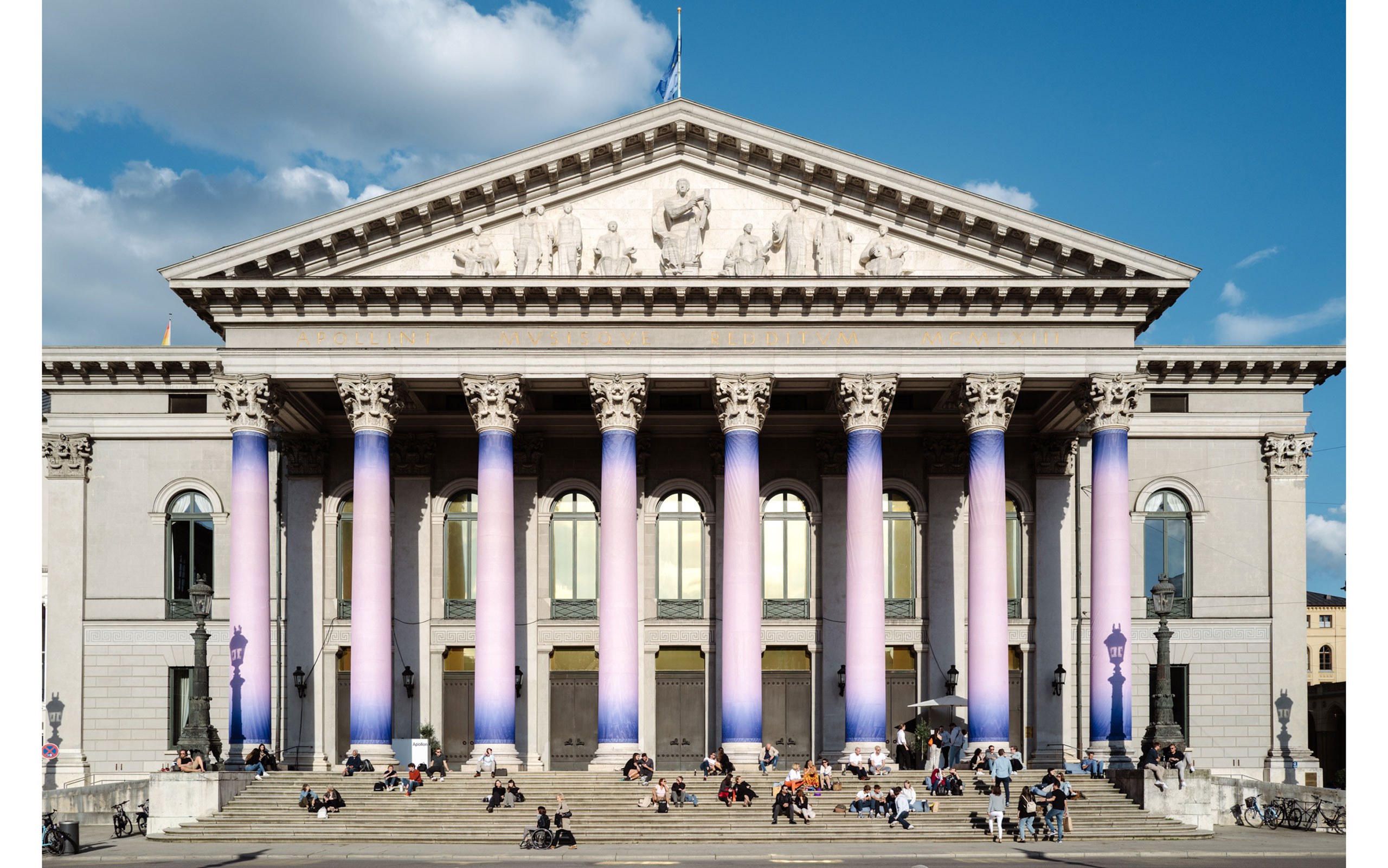
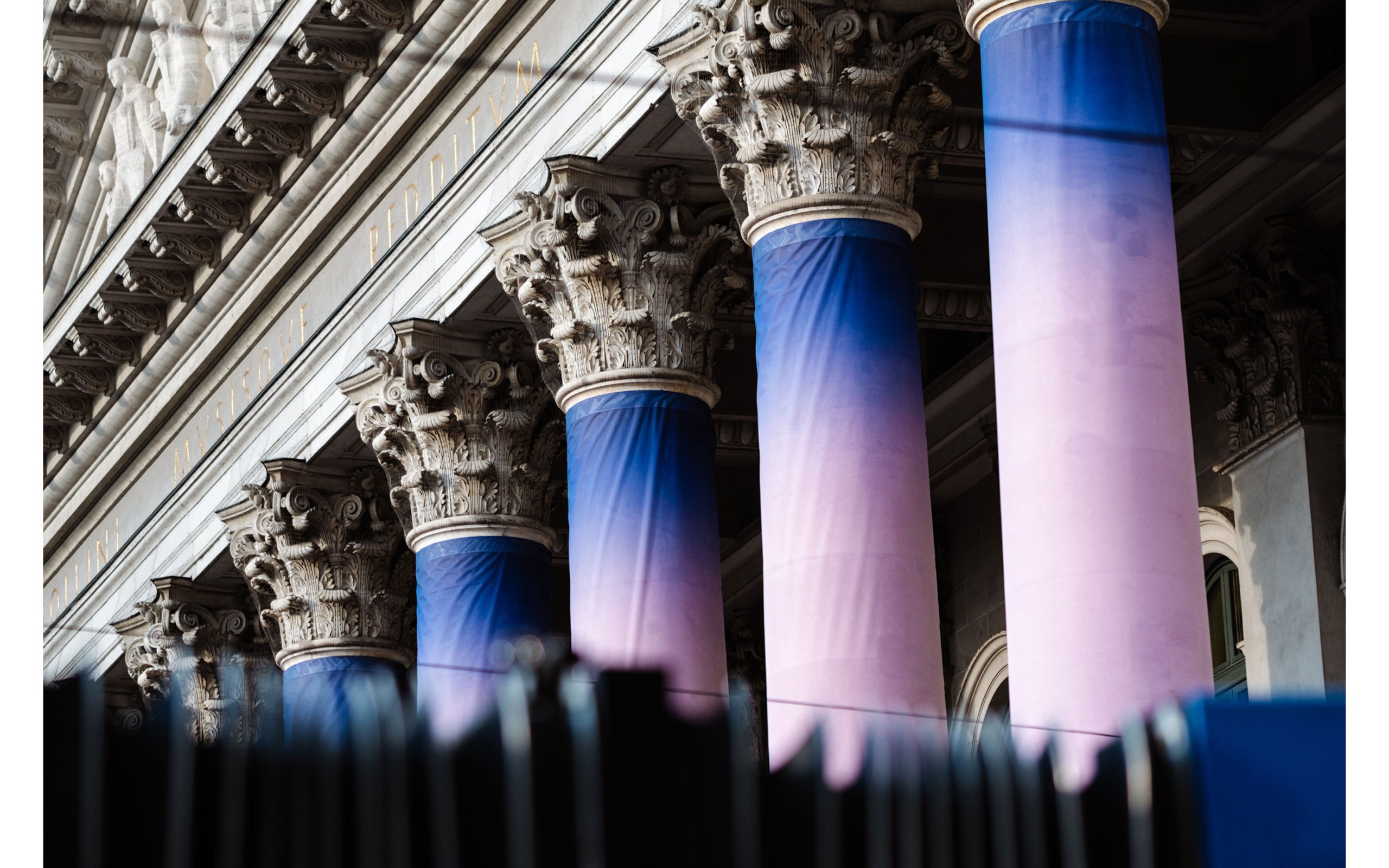
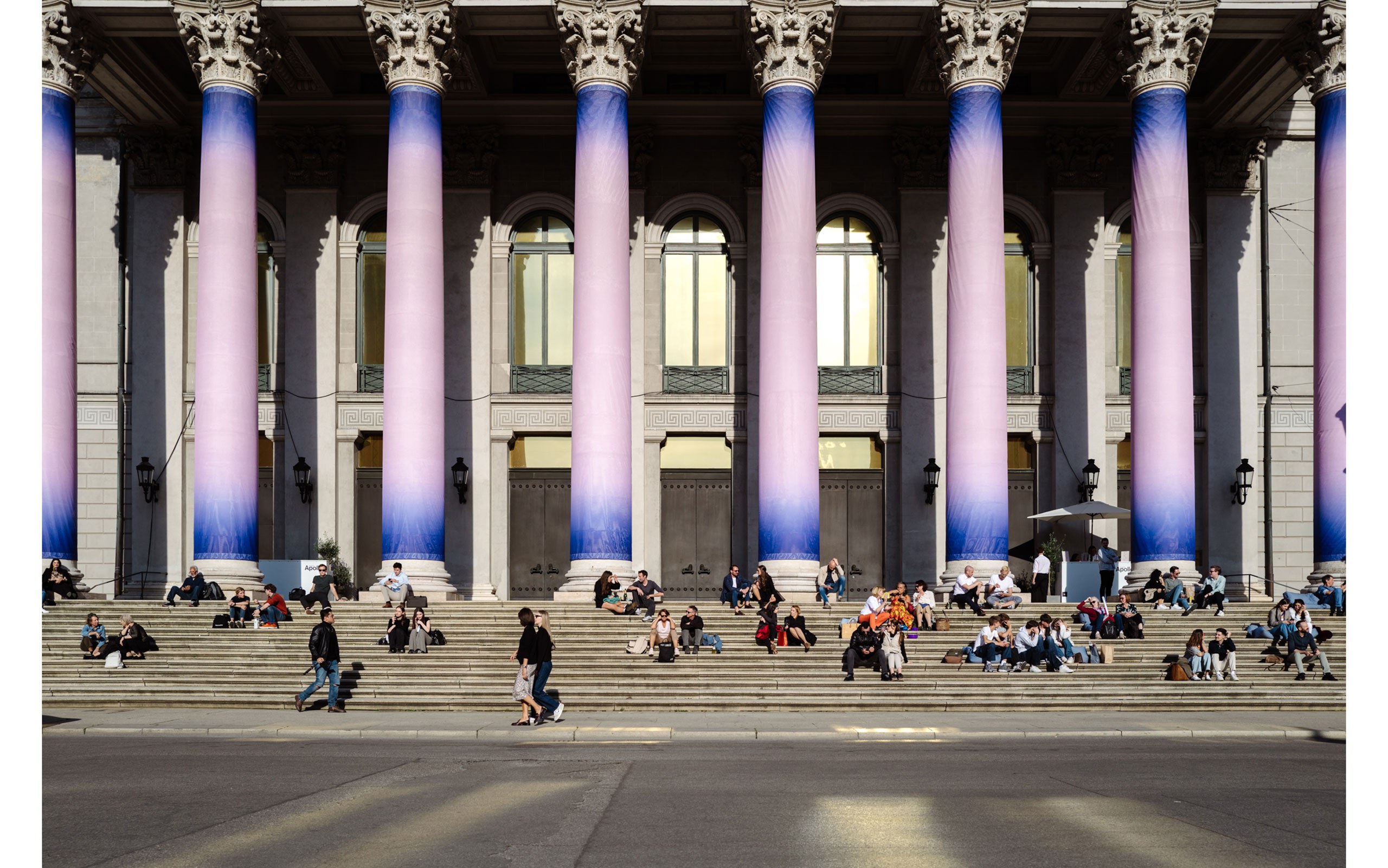
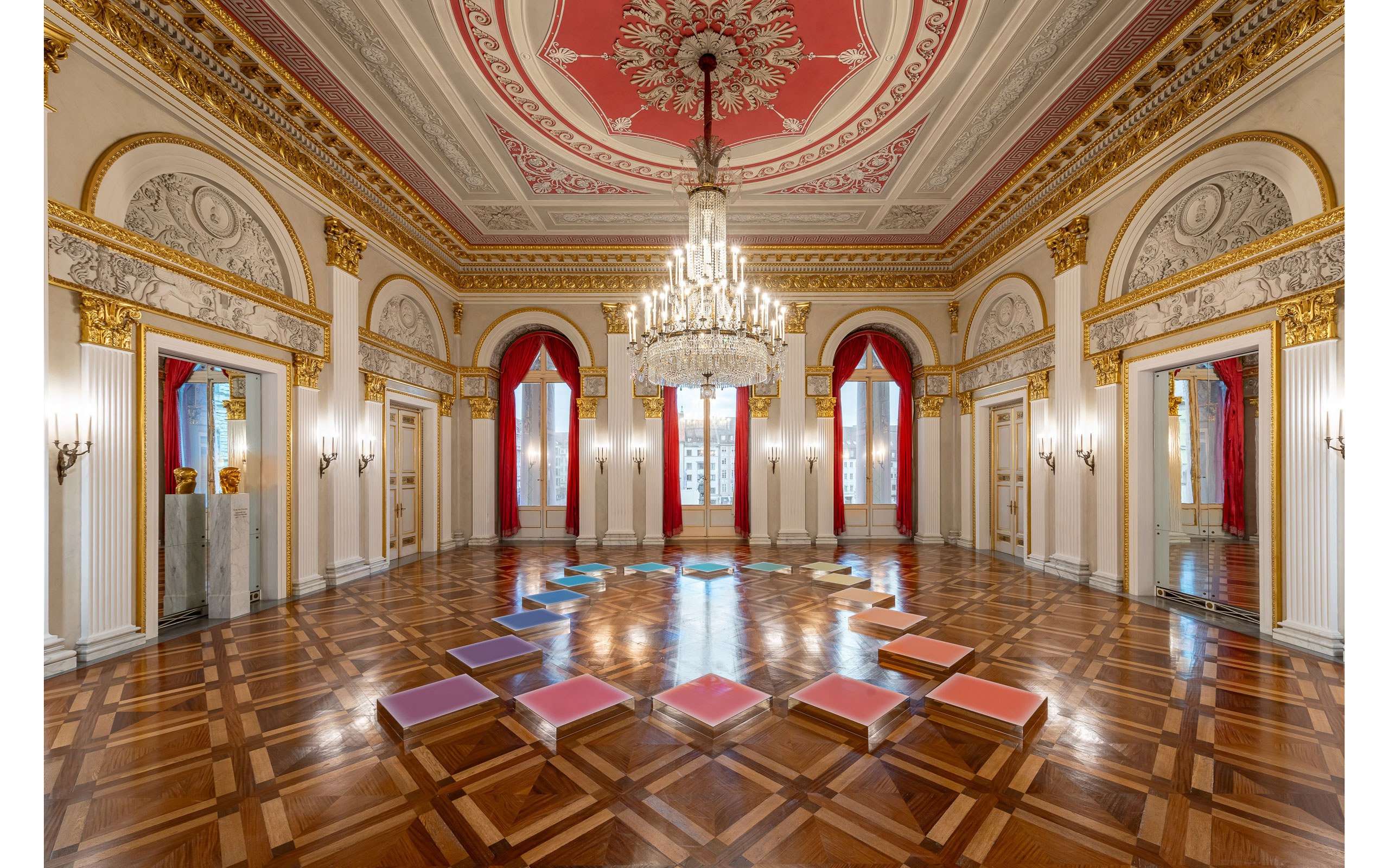
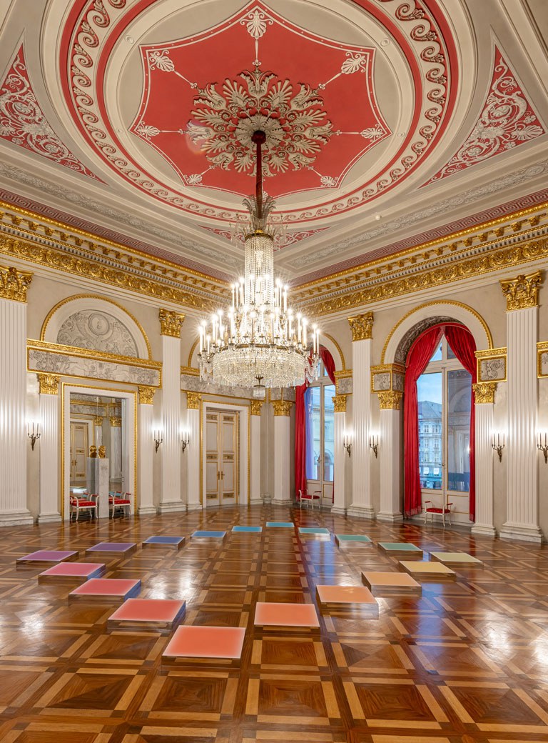
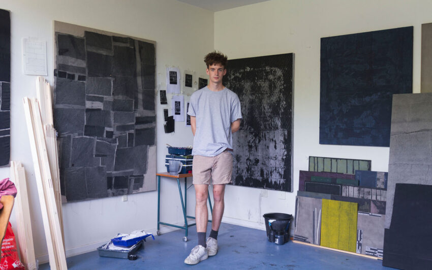
staring at the sky (munich), 2024

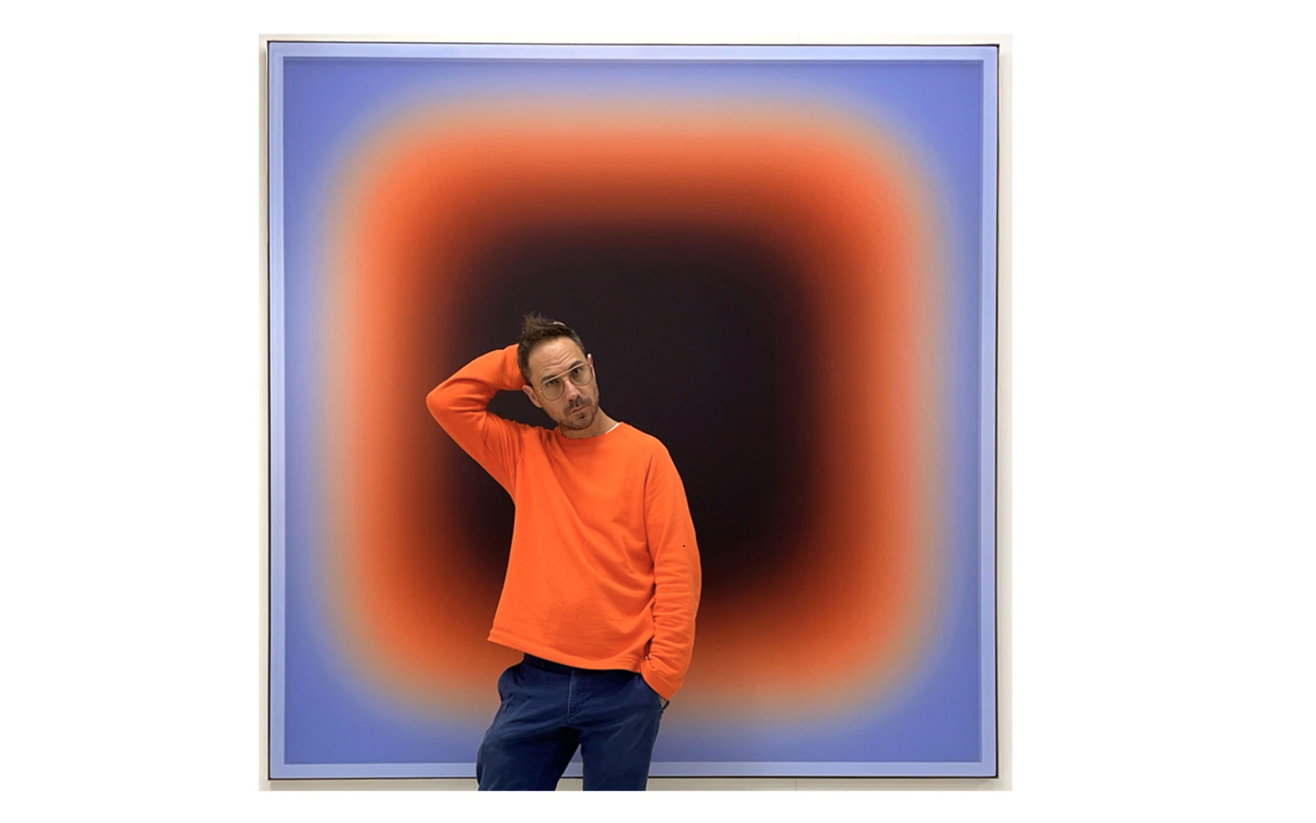
Jonny Niesche’s work has long drawn inspiration from fashion, cosmetics and music. On the occasion of the 2024 edition of the Munich Opera Festival, Jonny Niesche entered into a collaboration with the Bayerische Staatsoper, the festival’s operator, with a fulminant display of a series of his works at the Nationaltheater, the opera’s venue. The show extends to the public space, as the pillars of the classicist building are dressed with one of Niesche’s “portals”.

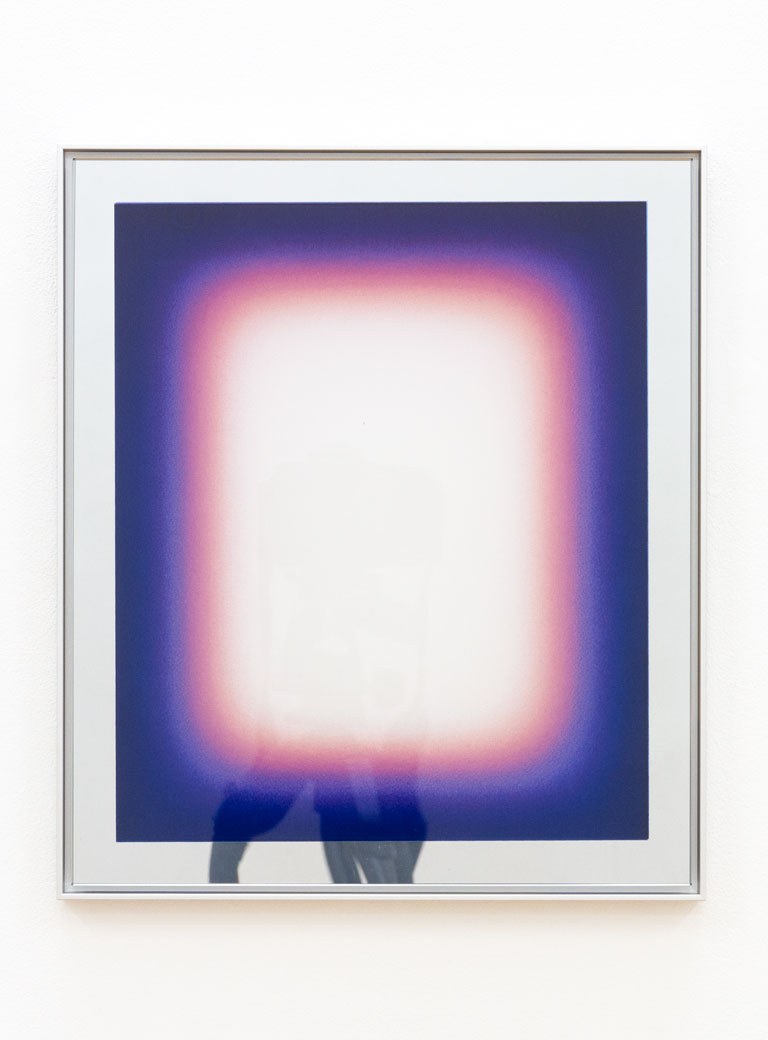
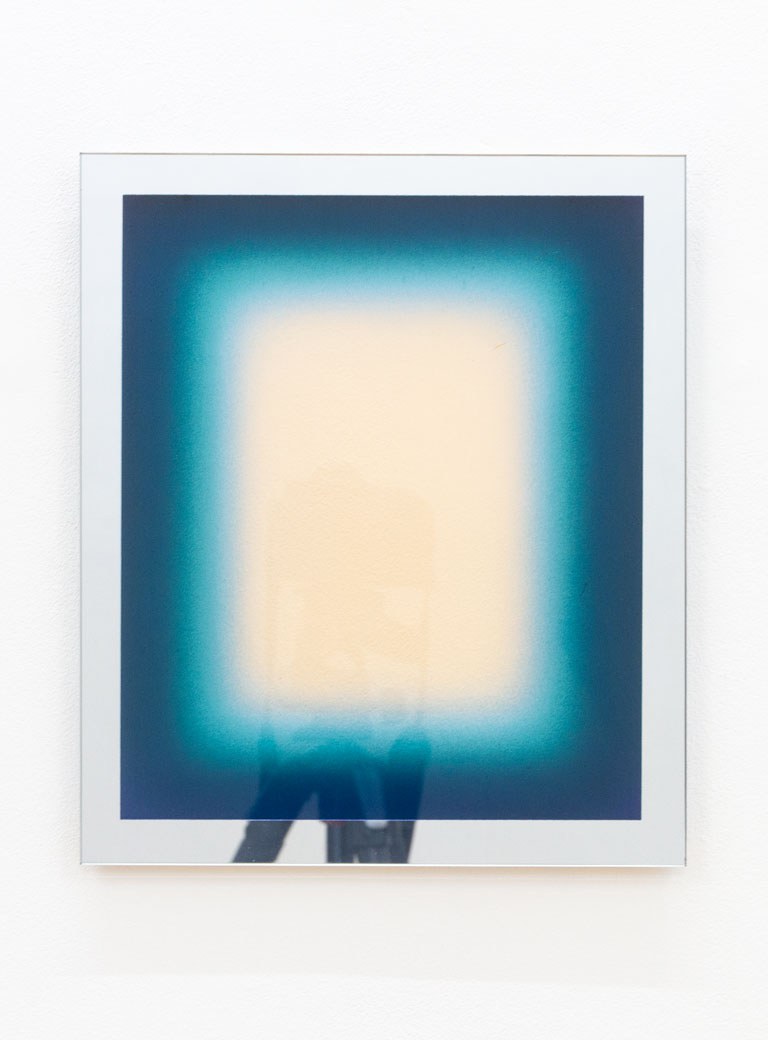
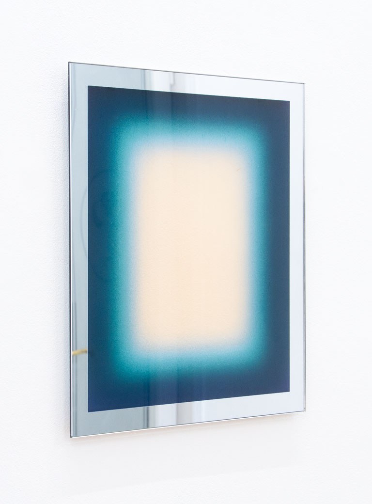
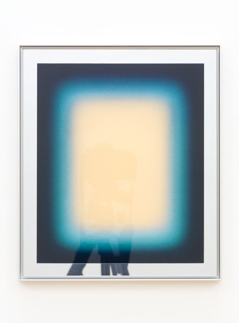
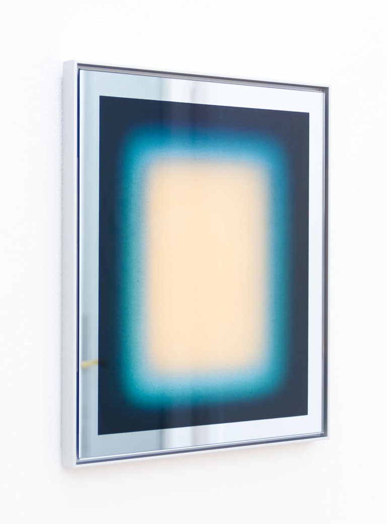
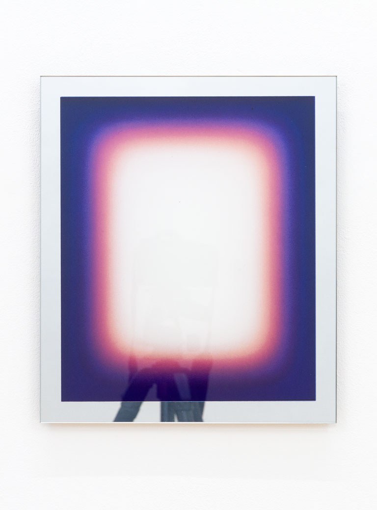
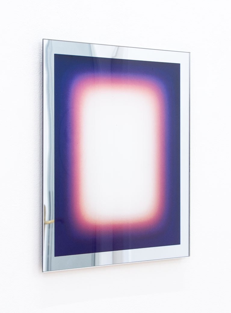
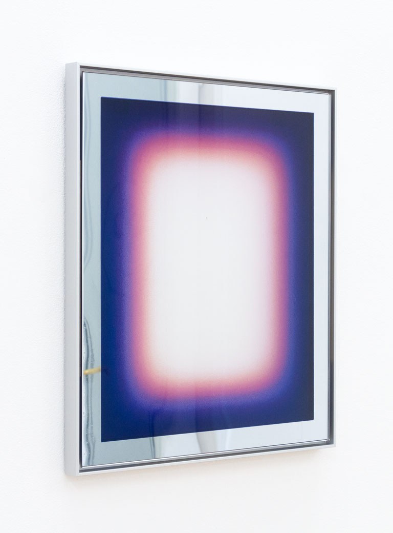
The edition staring at the sky (munich) has been created with Jonny Niesche and in cooperation with the editions gallery Collectors Agenda on the back of the event. It draws on three of Jonny Niesche’s most recent and visually most powerful works, chosen to visually accompany the Munich Opera Festival 2024. The edition derives its title from the central theme set by the Bayerische Staatsoper for its opera season 2023/24, which in turn draws on a quote by Portuguese poet and writer Fernando Pessoa, who mused on the dichotomy of the human soul when he wrote “We are two abysses. A well staring at the sky.” Accordingly each different motif in the edition takes up a key word from the quote: abyss (munich), well (munich) and sky (munich).

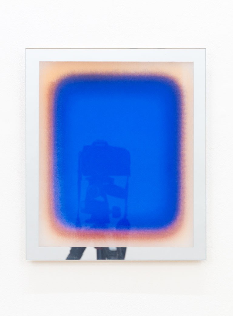
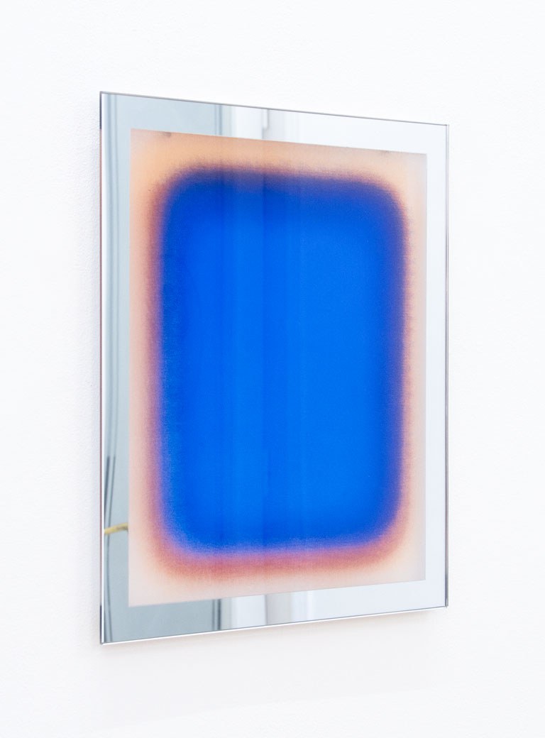
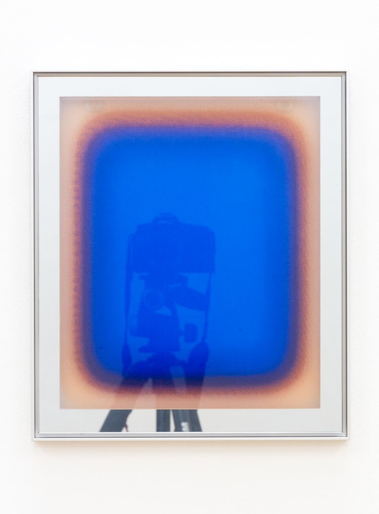
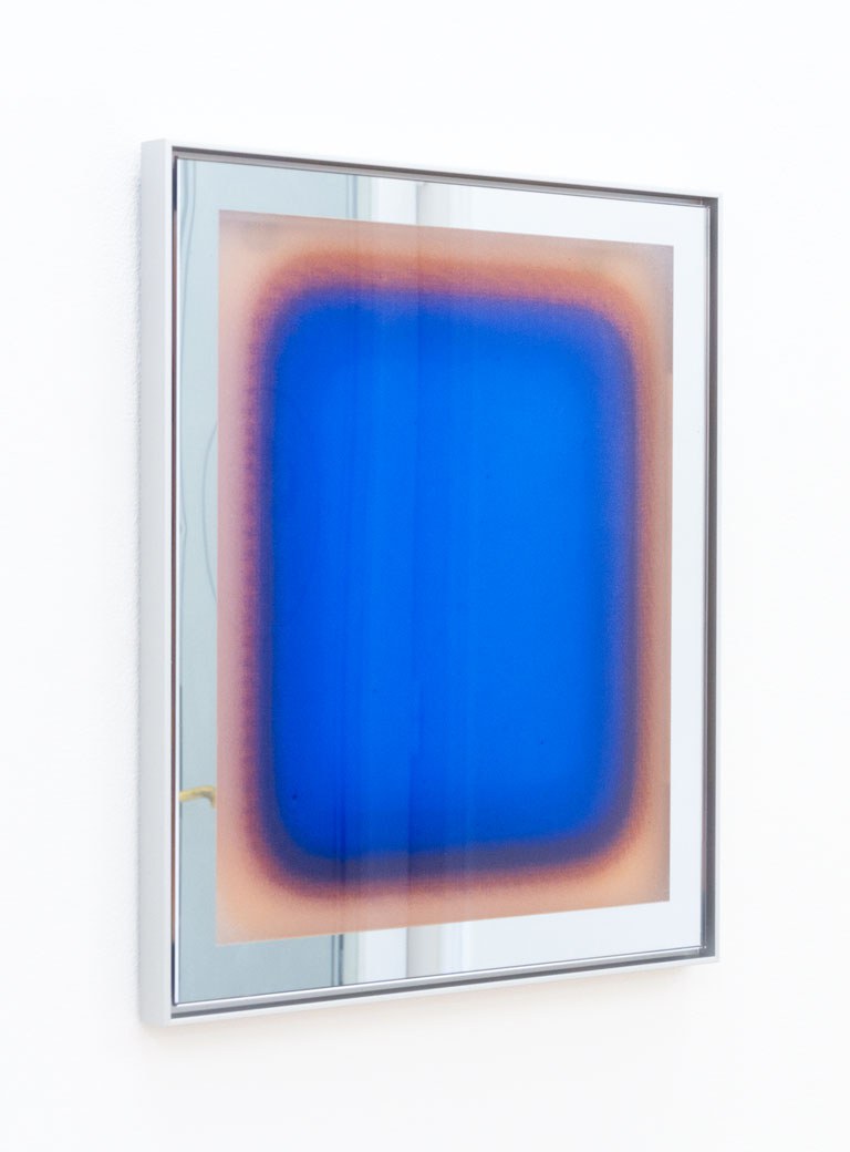
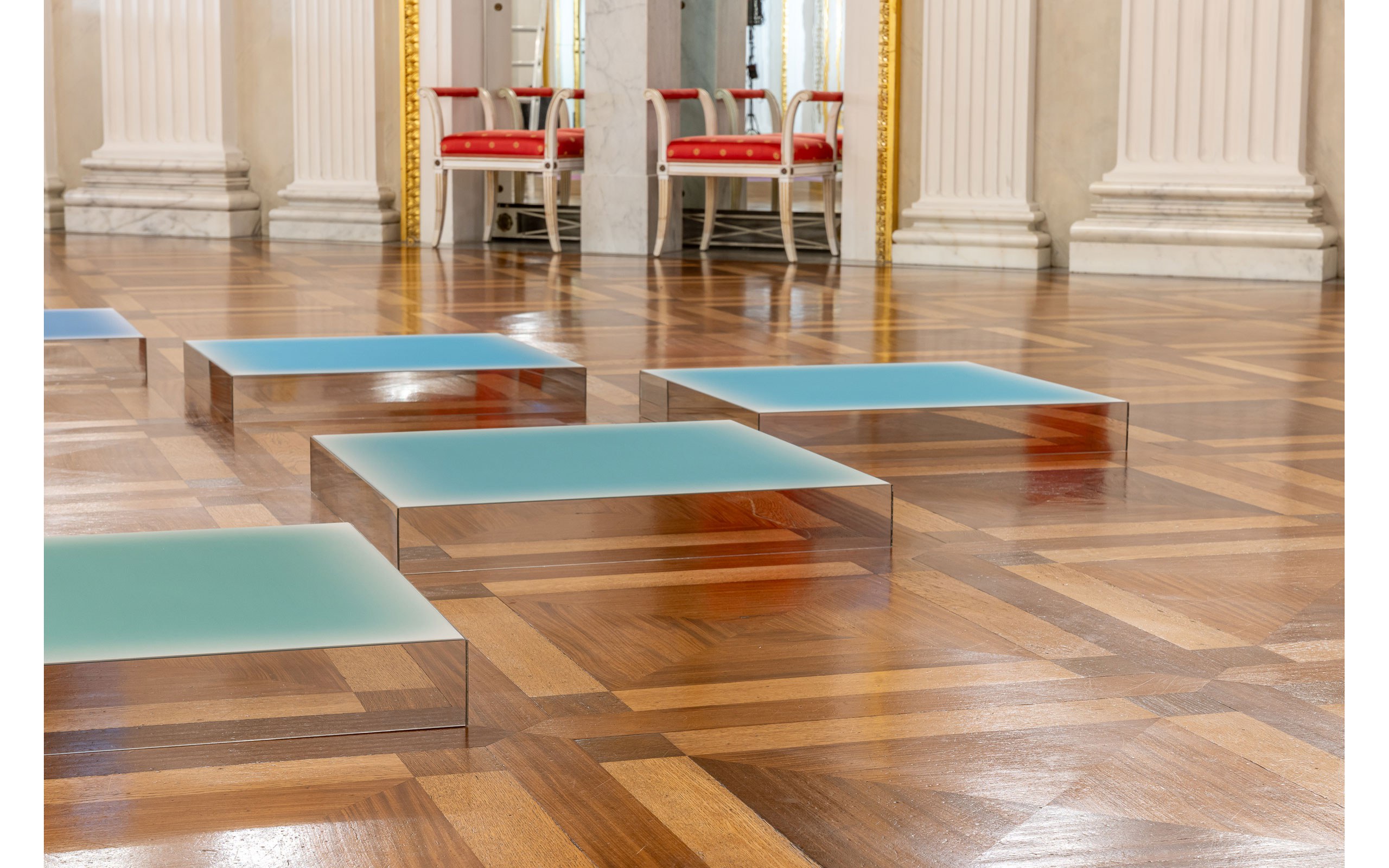
For its production, Jonny Niesche experimented for the first time with a print on glass technique that compares to the tradition of reverse glass painting as it was used for sacral paintings since the Middle Ages or for the icon paintings of the Byzantine Empire. One of the main challenges of the reverse glass painting process is the application of layers of colour to produce a certain visual effect, making it a highly sophisticated technique.

The edition’s production process involved the printing of ceramic pigment by silk-screen, requiring each colour to be previously hand-mixed from a very limited palette of available colours to approximate the visual appeal of the original reference work. Each pigment colour responds differently at various burning temperatures, requiring numerous burning runs to establish the ideal oven temperature. Equally, the colours react unforeseeably during the burning process when mixed or when layered on top of each other. Not only does this require rare craftsmanship, but a certain degree of openness as to the end result.

It was this alchemic quality of the process that intrigued Jonny Niesche to abandon his otherwise highly precise and controlled production process to see his work transformed into a new aesthetic experience. The aspects that usually create the seductive appeal of Jonny Niesche’s works, such as the moiré effect produced by the printed-on voile fabric or the self-reflection of the viewer in the shining surfaces, are giving way to new aesthetic qualities.

Where the silk-screen allowed pigments to pass, dots of colour stick to the glass surface, as if to offer a counter form to the printed-on grid-like mesh that Niesche usually employs. Silver paint applied to the back of the glass recreates the viewer’s image as in many of Niesche’s work. But for the first time, the viewer’s reflection occurs in real glass mirror, instead of polished steel or acryl.

The completely hand-made nature of each piece in the edition lends a unique quality to every individual work. The minimalist and sleek appeal of the edition is dramatically contrasted by the manual craftsmanship and imperfection, inherent in the rare and complex production process.

Jonny Niesche, abyss (munich), 2024 (wall-mounted as free-floating)

Jonny Niesche, abyss (munich), 2024 (wall-mounted as free-floating)

Jonny Niesche, abyss (munich), 2024 (framed)

Jonny Niesche, abyss (munich), 2024 (framed)

Jonny Niesche, well (munich), 2024 (wall-mounted as free-floating)

Jonny Niesche, well (munich), 2024 (wall-mounted as free-floating)

Jonny Niesche, well (munich), 2024 (framed)

Jonny Niesche, well (munich), 2024 (framed)

Jonny Niesche, sky (munich), 2024 (wall-mounted as free-floating)

Jonny Niesche, sky (munich), 2024 (wall-mounted as free-floating)

Jonny Niesche, sky (munich), 2024 (framed)

Jonny Niesche, sky (munich), 2024 (framed)

Please note

The edition has been produced to handmade quality. The silkscreen print on glass production method is prone to unpredictability and imperfection of the result, which was an aspect Jonny Niesche was particularly interested in. Each piece in the edition may be considered unique in that each differs on the basis of potentially containing small streaks, minuscule debris, minor air bubbles or other enclosures in the burned colour layers or the silver band. These optical properties do not represent a fault but are characteristic of the chosen production method.

Jonny Niesche c Jonny Niesche

Jonny Niesche

Jonny Niesche (*Sydney, 1972) works across an expanded field of painting, sculpture and abstraction. His vividly coloured work wraps the viewer in total sensory stimulation. The seductive, iridescent surfaces of his paintings hum and shimmer with pigment - colour that seems to float slightly above the surface. The effect is intensified by the indistinct edges between bands of colour that surround the middle-ground colour field. As one tone blurs and dissolves into the next, a silky insubstantiality of pure colour and sensation emerges.

Inspired by the colour theory of Josef Albers, the great minimal artists such as Donald Judd or the pioneers of light art including Dan Flavin and James Turrell, Niesche has long worked with the intrinsic relationship between colour, form and light to produce formal and optically charged works that challenge our perception of space.

Besides the influence by formal elements from twentieth-century art, Niesche’s practice also draws on the shiny allure of popular culture, combining the best of disco’s theatrical and decadent aesthetic, paired with a sense of detached minimalism. Tonal gradients from the cover of David Bowie’s Aladdin Sane or the shades of Debbie Harry’s 1970s make-up have equally determined the colour palette of different work cycles. With a materially fetishistic appeal, glitter, mirror, translucent custom-dyed fabrics and steel, combine to offer a glamorous urban beauty.

Jonny Niesche graduated with a Master of Visual Arts, from Sydney University, AU in 2013. Recent solo and group exhibitions include: Metamorphosis, Art Gallery of South Australia (2024); _ness, Fundación La Nave Salinas (2023); Furry Light, West Lotto Münster (2022); Atoms Encode,1301SW (2022); Dreaming after all, is a form of planning, 1301PE (2021); poikilos, STARKWHITE (2020); Zeller van Almsick (2020); Ways of Seeing, Art Gallery of South Australia (2019); New Acquisitions from the Collection, Museum of Contemporary Art, Sydney (2019); Museum of Contemporary Art, Sydney (2018); Shut up and Paint, National Gallery of Victoria, Melbourne (2016).

Read our studio story with Jonny Niesche.

Bayerische Staatsoper Saeulenverkleidung c Geoffroy Schied 1011741

(c) Geoffroy Schied

(c) Geoffroy Schied

(c) Geoffroy Schied

Installation Jonny Niesche c Dirk Tacke 2

(c) Dirk Tacke

(c) Dirk Tacke

(c) Dirk Tacke

Text: Florian Langhammer
Photo: Courtesy of the artist

Connect with us
Sign up to be among the first to learn about new stories and edition releases along with our bi-weekly Culture Briefing.