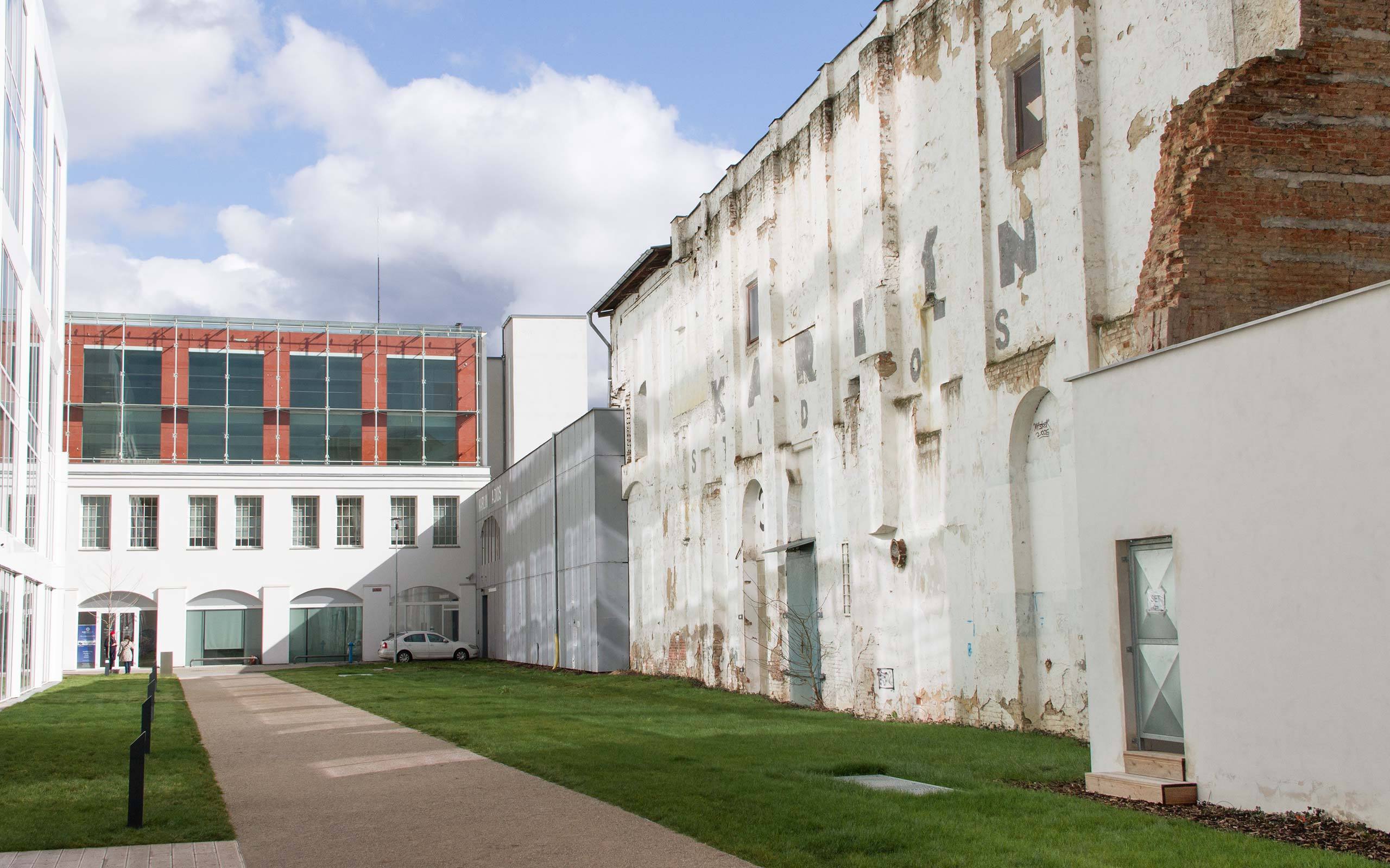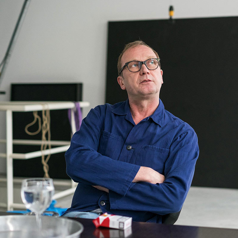
We are said to have arrived in an age of imagery, in which the written word is losing ground against visuals. Looking at the work of Czech artist Jan Šerých, the contrary appears to be the case. Or maybe not? We met Jan at the Karlin Studios in Prague, an old factory hall repurposed as a collective artist space and recently released for demolision, to talk about the relevance of colour, his reluctance to rely on art alone, and the bright and the dark side of himself.
Jan, looking at your work on your studio walls it is striking that it relates a lot to typography. It is difficult to decide whether we are viewing or actually 'reading' your work. Thinking about artistic disciplines, as they are traditionally categorised, would you consider yourself a painter, a typographer, or possibly even a poet?
I am doing paintings, yes. But I am also a typographer. I don't really care about what I am, in fact. But I am not a poet, that's for sure. My work is too visual for poetry I think. Do you know Boris Ondreička? He lives partly in Vienna. For me he is a real poet. My work is more based or still anchored on visual effect, such as the shape of the type.
How would you describe what you do every day to someone who does not know you and your work?
My job is the one of a typographer, and sometimes also of an artist. (laughs) It's hard to describe, but yes: I am a graphic designer. In secondary school I studied graphic design, but I decided to quit to study art. So, I studied painting and new media and related subjects. However, after the graduation, for some reason I went back to design practice. I usually work for publishing agencies, making books and so on. It's not the kind of hard core graphic design, but it's close enough to typography and its principles.
That's interesting. So you never quit your design job to be an artist. You do both.
I never relied on my artistic practice as a full-time job. Never. It was not possible, in fact. It's a money issue, bluntly speaking. I think it's good to not only rely on art, somehow. I'm a quite practical person, you know. And doing art is strange work. If you are practicing as a designer you have to draw on a range of different skills, and you have to communicate with different audiences of people. I work at Karolinum Press, the publishing house of Charles University in Prague. You find many artists and people there from different branches and it's quite interesting to communicate with all of them. In a way, I am able to have the best of both worlds.
Isn't it hard to play both roles? Aren't artistic practice and the work of a designer quite different?
Yes, it's quite difficult, but somehow it's the same. In turn, I feel it can also be difficult to perform in one role full-time. The visuality of my graphic practice and artistic practice are completely different, and the way of thinking about things is different. But, in fact, the main difference is that, in my graphic practice, I have to be positive while in my artistic practice I can afford to be completely negative, which I usually am.
The bright side and the dark side of Jan Šerých?
I haven't thought about that before, but yes, it's possible. I think so! (laughs)
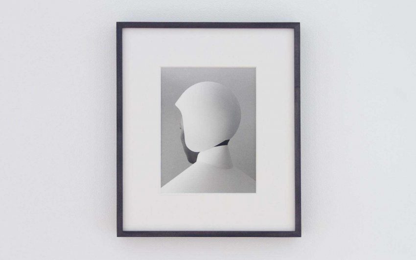
A lot of the works you produce are black and white. Would you say that they carry something negative in them?
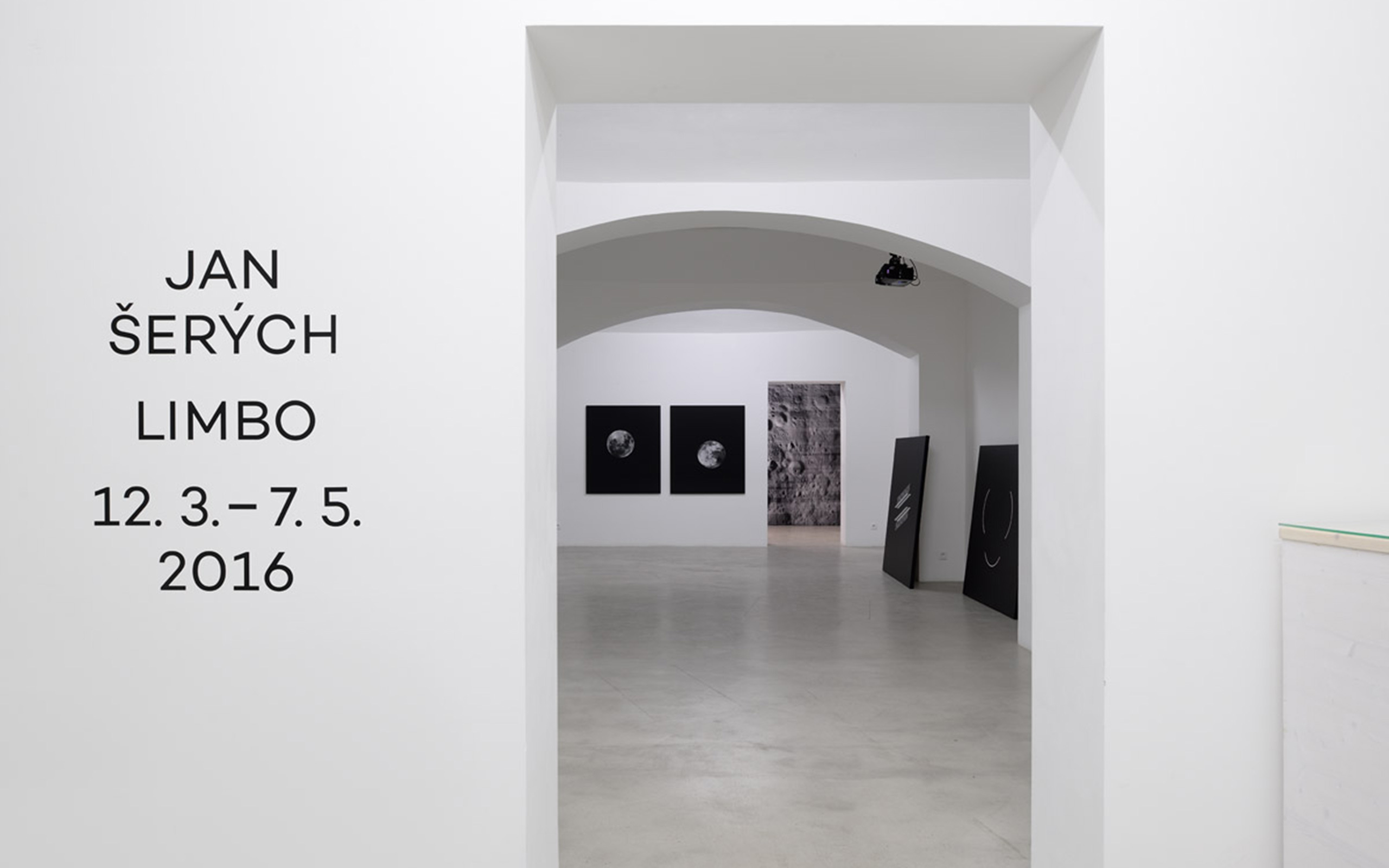
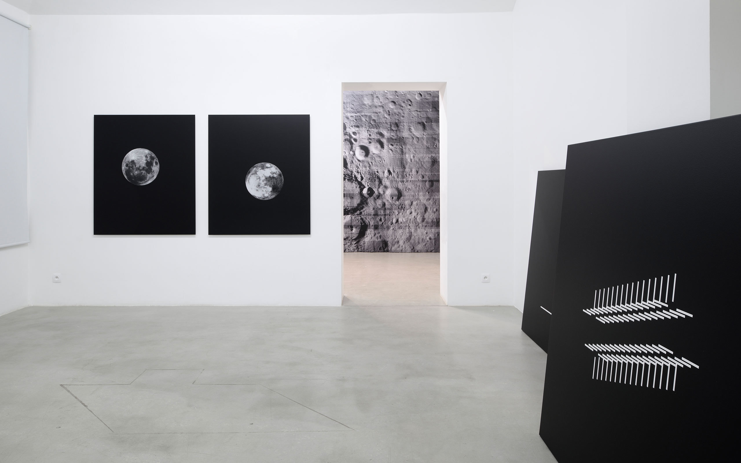
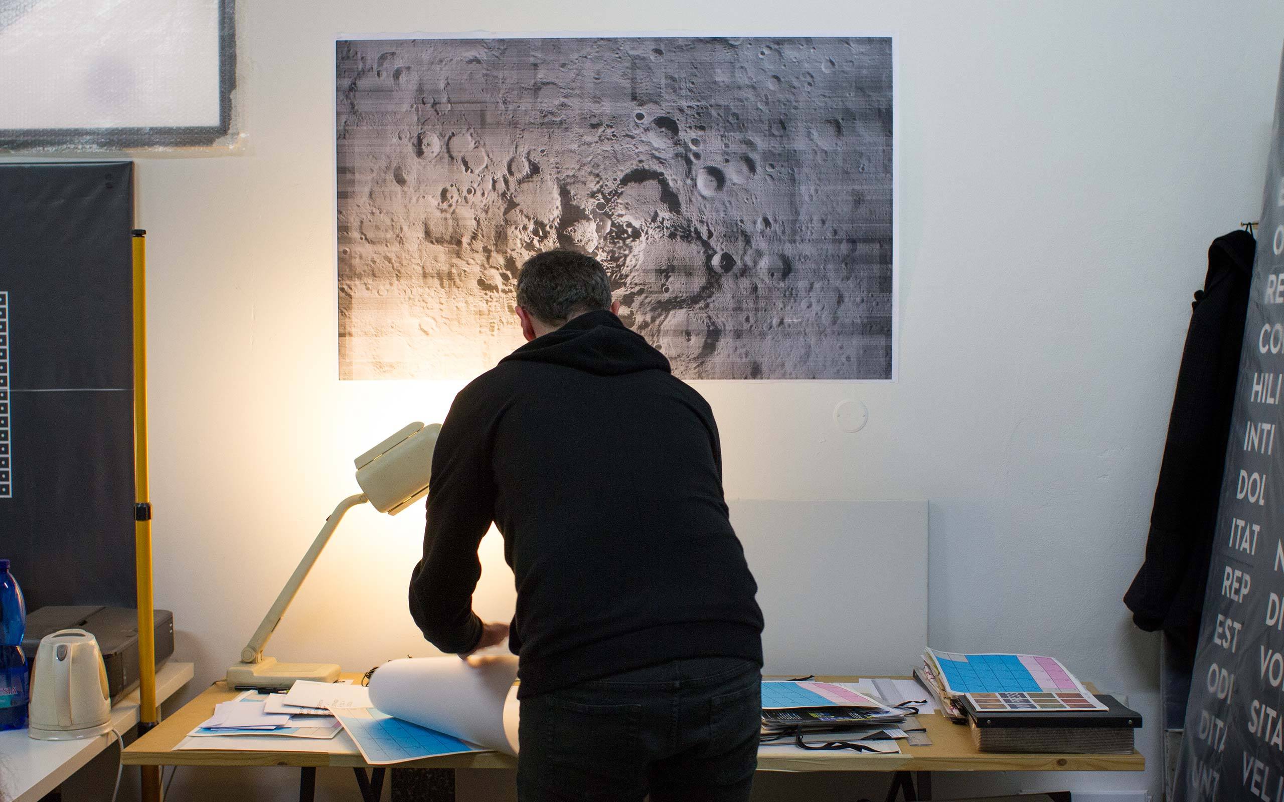
Black and white is just the visual side. But yes, my current show at Hunt Kastner is quite negative I think. It's about the impossiblity to comprehend the world we are living in. Exploring the world has some limits. I also like to play with signs, which are based on our habits. For example: At Hunt Kastner's Limbo exhibition I show two prints of the moon – one is negative and one is upside down. So, both images are somehow lying. On the other hand you are relying on your approximative knowledge of something. What I am saying is, that you turn to things you have previously learned to interpret and to construct meaning, based on what you are confronted with.
You are playing with things, which appear to us as clear, familiar and evident. But, at a closer look, they strike us as strange or they fall apart entirely.
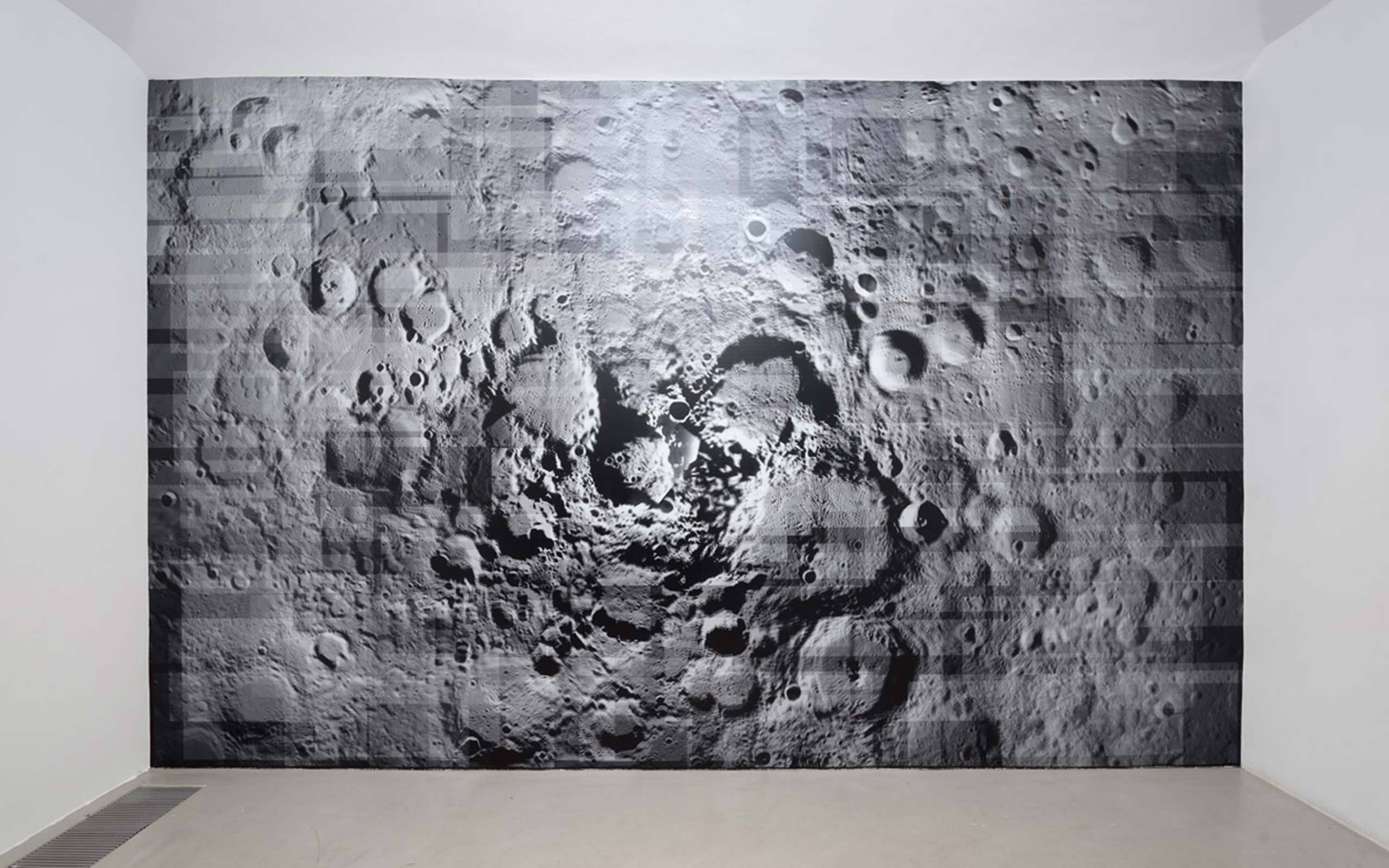
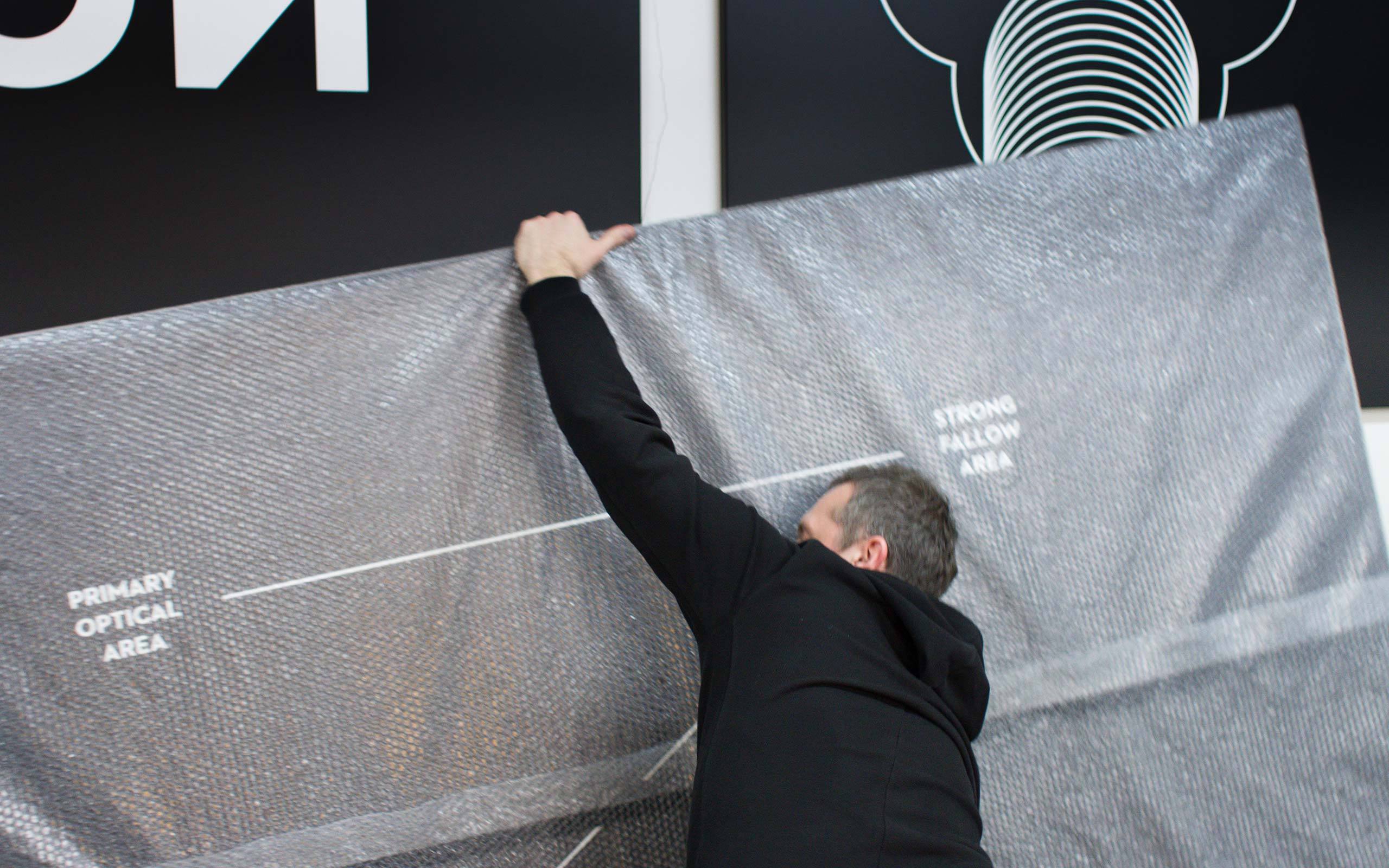
Yes, I think that is quite precise. For example the print on the wall shows the moon. Factually it is not a genuine representation of the moon, but only a composition of about 200 screenshots, which I found on Google Moon. It's not complete yet. The challenge will be to produce it in its final size in high quality. It's supposed to measure about five to three-and-a-half meters.
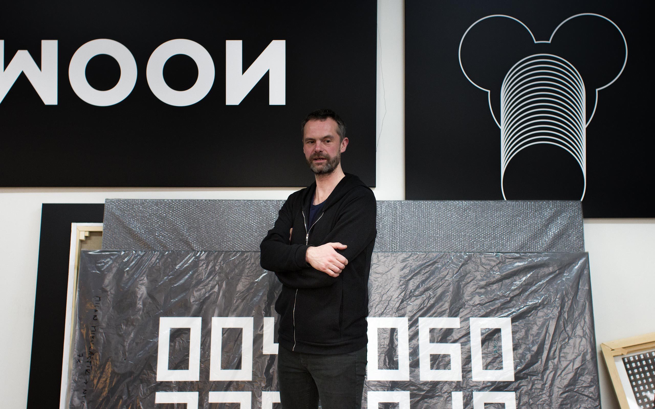
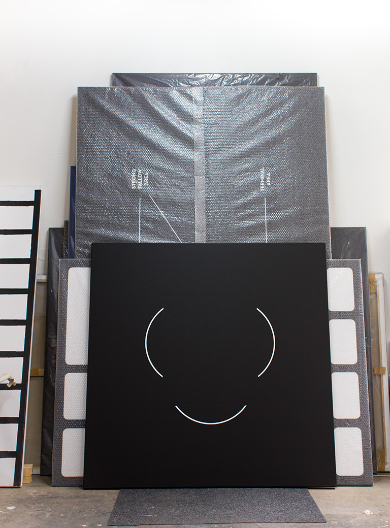
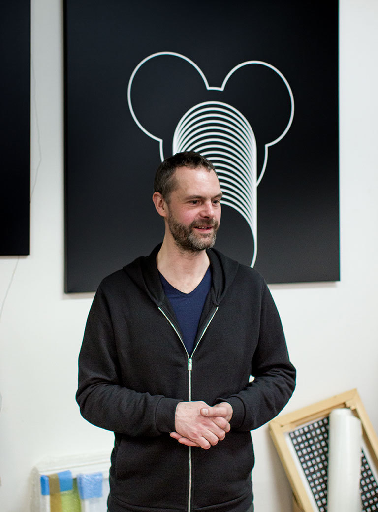
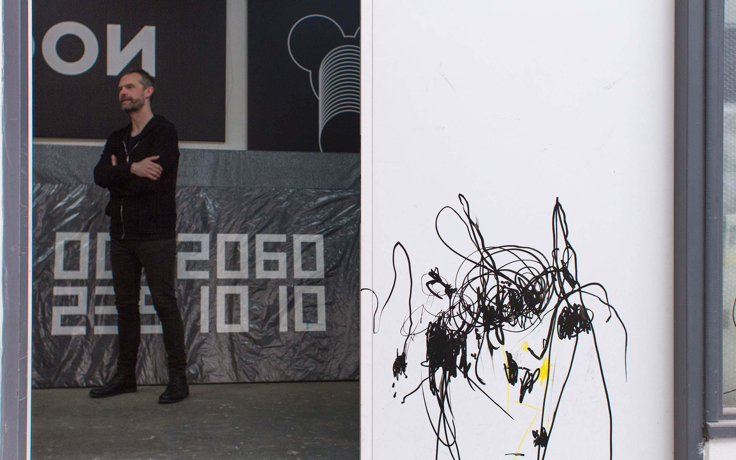
There are some pictures that evoke familiarity. For example Mickey Mouse here.
Is it Mickey Mouse?
Well, let's say it is an object – something you recognise, that triggers something. There is this strong association with commerce, maybe even with domination of American culture. Mickey Mouse to me is just really commercial.
Yes, I believe that's true.
There also seems to be another commercial metaphor in it. A stack coins or something… But that's just me. Where does it come from, why Mickey Mouse of all things?
I wasn't exactly thinking of Mickey Mouse when I created this. It is the shape or image that appeared to me in a dream. I know it sounds strange. What you said was your interpretation of it. I think it's not false, because I used to work with these shapes, and only later they somehow reminded me of a stack of money. On the other hand it could be just growth, an explosion, whatever! It could even be something else really strange... I think you can read my pictures quite easily.
It looks like a subtle way of political art in a way. Is it your intention to do political art or giving a political statement with your work?
Is it? That's good to hear. (laughs) Well, it could be, but I'm not quite sure, if I want to operate with this term. I don't have a problem if anybody else does it, that's quite okay, but I don't want to push it in front of my work. Or do you think all depressing works are political? Maybe yes!
As you said once, you are not a lover of the art market, but, as an artist, you are part of the game. Your gallery Hunt Kastner is one of the biggest galleries in Czech Republic and highly regarded internationally.
That's true. To some degree I am part of it. Although I never actively participated in the big art world, I understand the dynamics of it. I am not completely negative about the art market, because my gallery protects me from it. I am very grateful to them for this, because art, for me, is the only area in which I can afford to say "No", to almost everything. It is a kind of playground for me. And that's maybe why I don't want to be relying just on art, because I want to keep enjoying this part of what I am doing with the maximum freedom. And it becomes more difficult when you start making yourself too dependent on one thing. If I am relying on the art world, it is not in terms of income, but in terms of ideology.
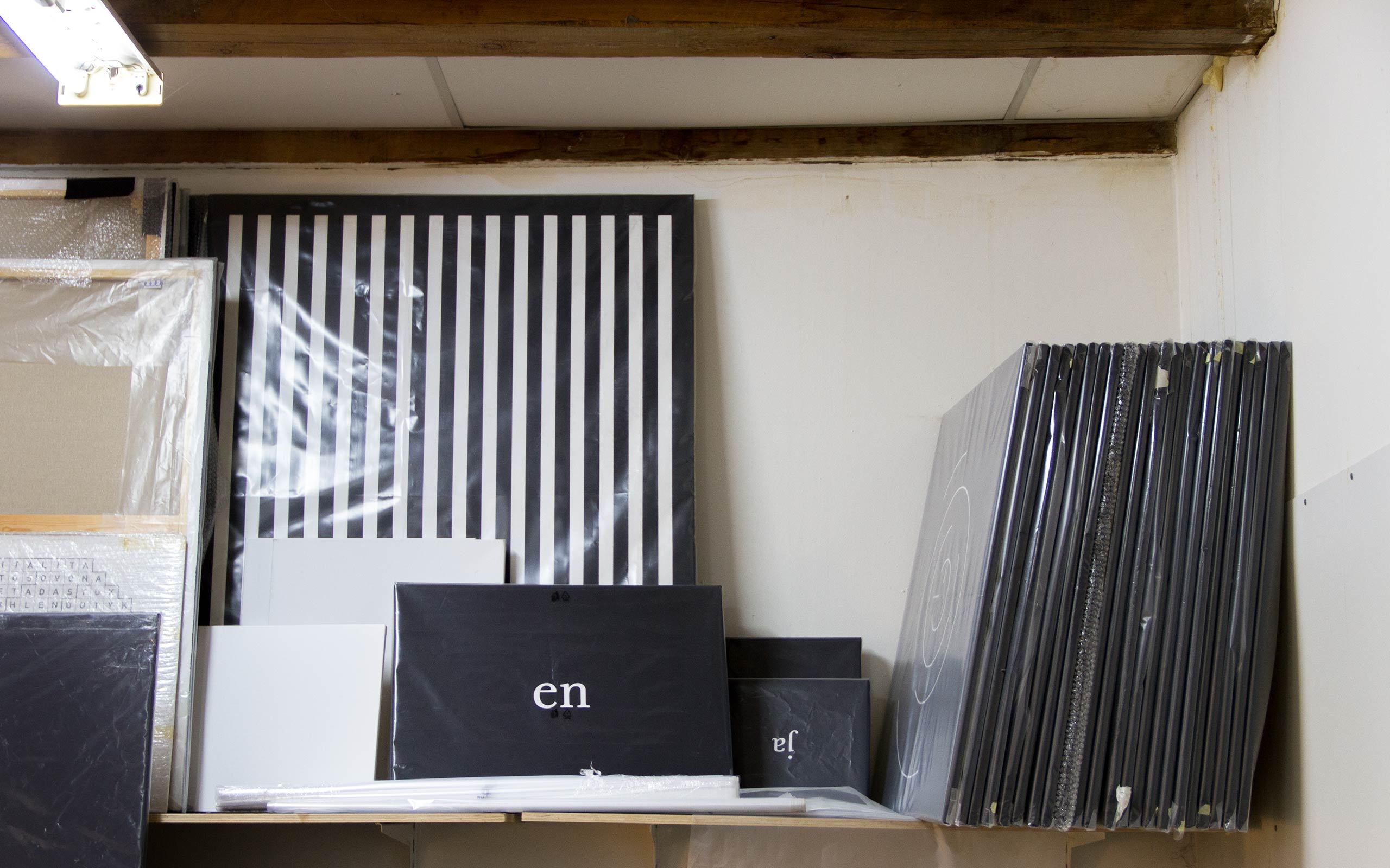
Your older paintings are mostly black and white and on large-scale canvas.
That's true in parts only. I did white on blue as well. But I don't care about colour, really. I think the main information is not the colour, but shapes or signs. It could be pink or green as well, whatever. Perhaps my works are not real paintings, because they are not dealing with colour.
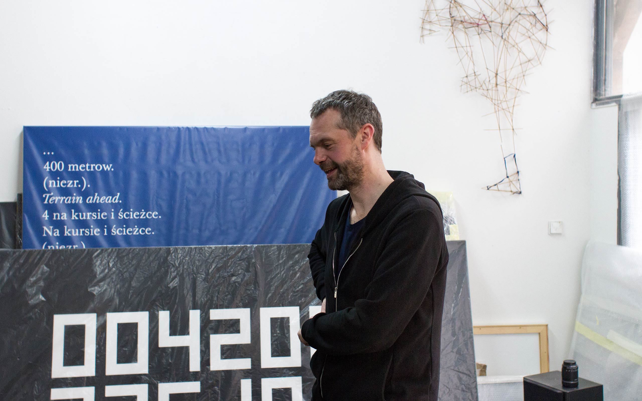
Are these the paintings in white on blue?
The two pieces show the live transcript of the black box of the crashed airplane, in which Poland's President Lech Kaczynski and his wife, along with other government officials, were killed. The numbers represent the altitude towards ground. And everything written in italic is the radio transmission from the tower. It feels almost like a theatre script. It's got something fateful, unavoidable about it. The two pieces are supposed to be hung on top of each other, like a tower, to evoke this sense of altitude. And it was somehow clear to me that this piece of work just had to be blue. The work title is The Office Blue. To me it is like a very specific blue, so I wanted to give it a name. Just as you would say: Yves Klein Blue.
The way you approach colour feels almost cryptic.
Yes, sometimes that's true. This piece here shows strings of numbers. The numbers are transposed from telephone numbers to RGB codes. It's quite complicated, but you recognize some Czech names, maybe. Each name represents one colour via the telephone number. If you translate a Prague phone number, which has nine digits, to RGB code, you can get this green for example.
It's quite conceptional. And pretty cool.
Yes, quite. But it's more fun than real concept. It's more about the names. Even for a Czech some names sounds really strange. They are all real people, although I never met them. I was mainly interested in finding telephone numbers that would work within the RGB code system.
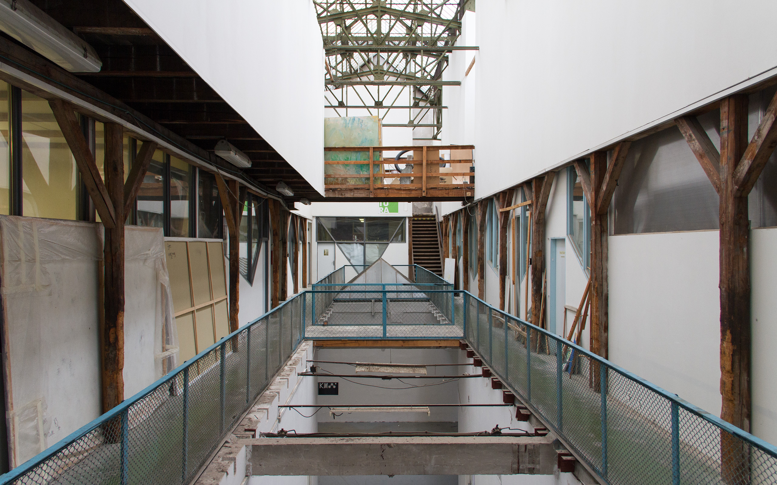
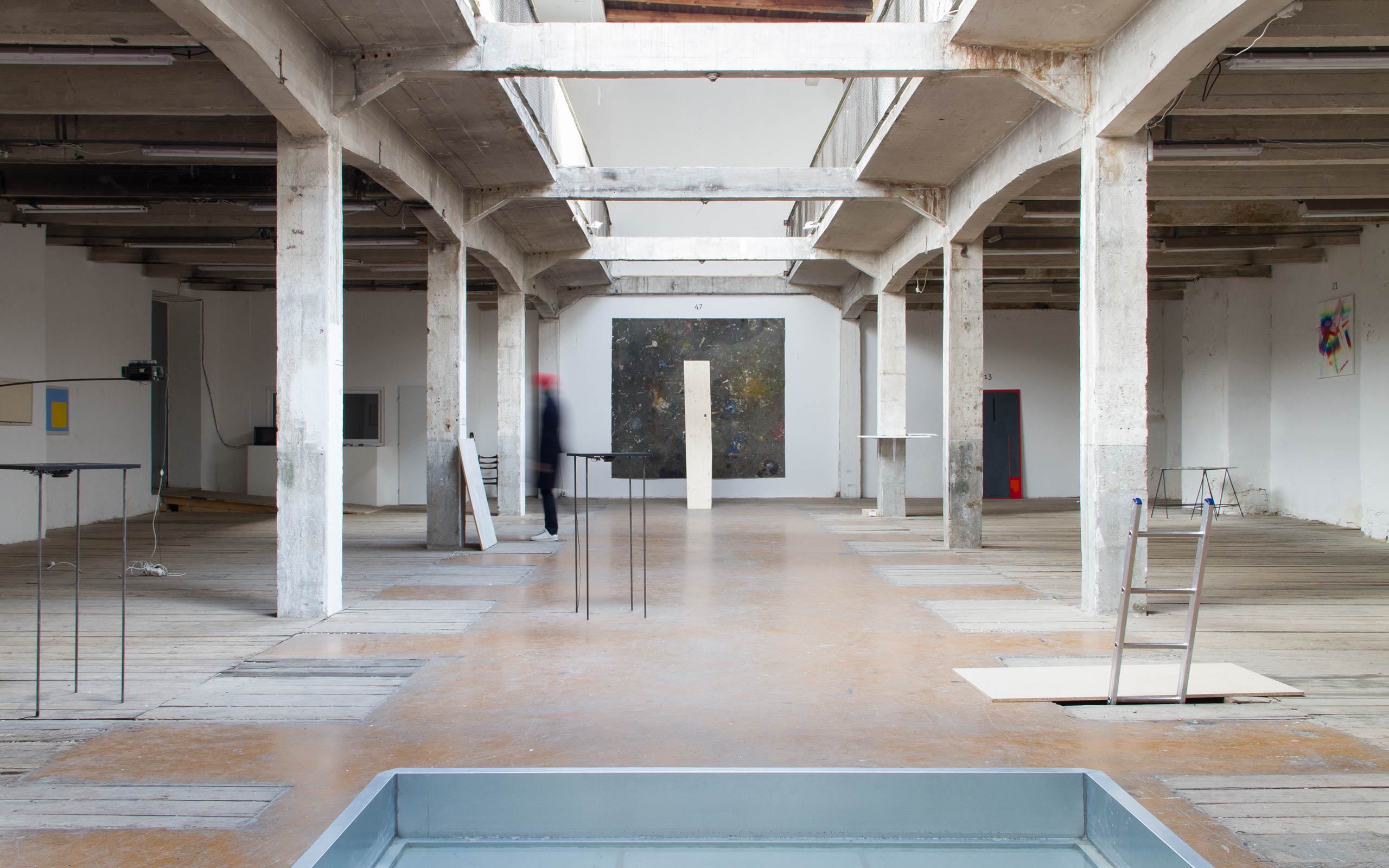
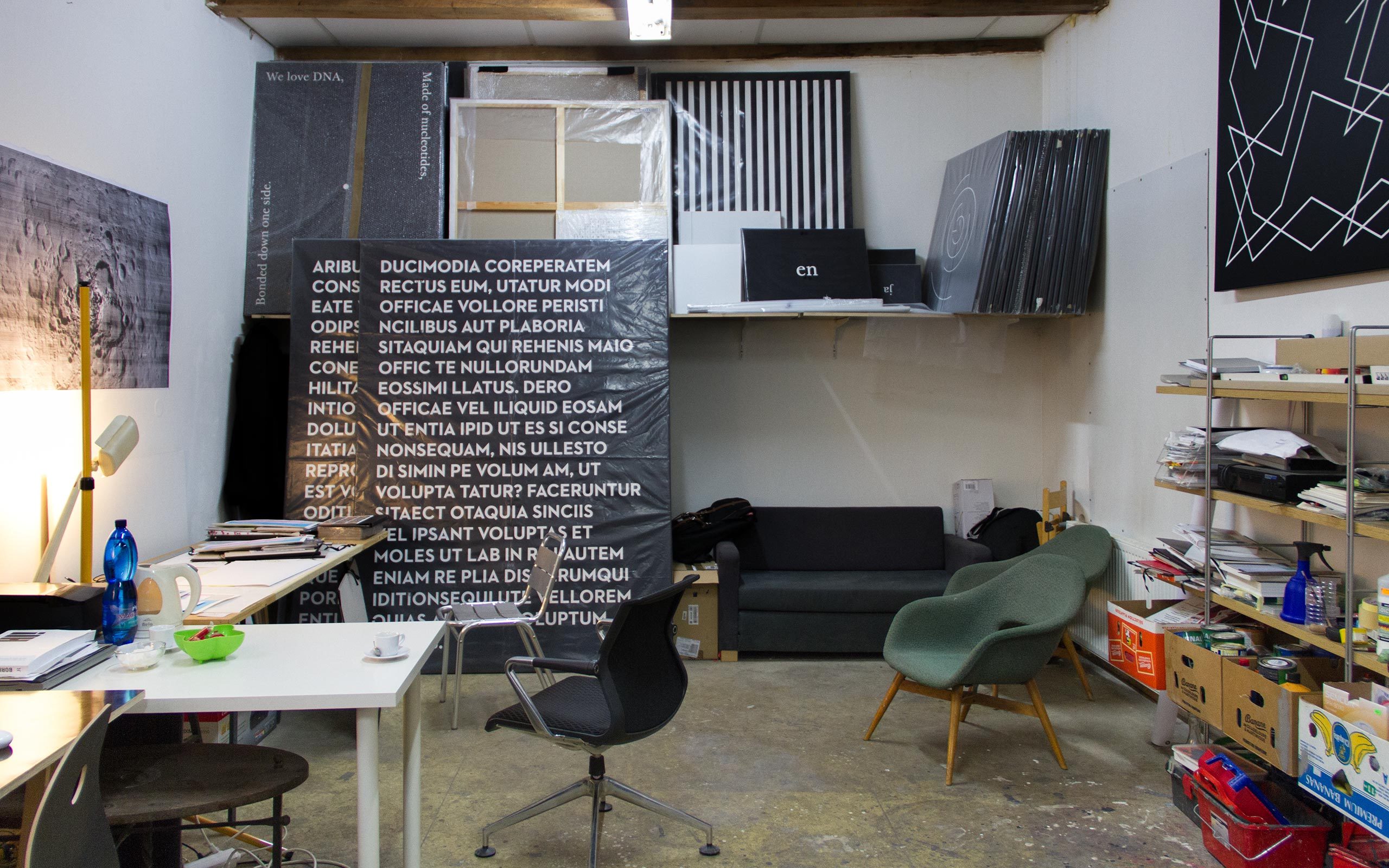
The Karlin Studios, where we are right now, house artist studios and an exhibition space.
Yes. It is a fantastic place, where around 15 artists have their studios in here. I have been in here for 8 years. Even if I don't know all of the people here, because there has been a lot of change during the past few years, we are a great community here. Unfortunately the halls will be demolished and must give the way for new commercial office spaces.
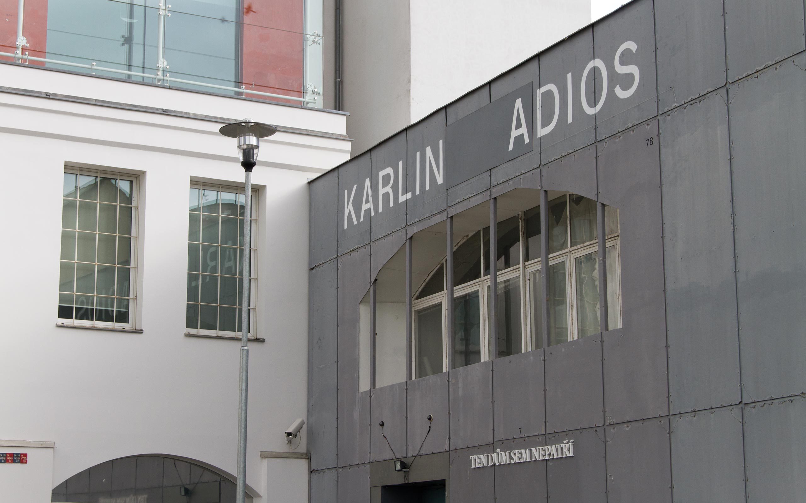
Above the entrance we read ‘Karlin Adios’. What's that all about?
The current exhibition, which can be seen downstairs is called THIS BUILDING DOESN’T BELONG HERE. It will be one of the last shows we will be able to house here. Ivars Gravlejs created the intervention on the roof of the factory hall, turning "Karlin Studios" into "Karlin Adios".
When will the studios be taken down?
Next year. I think it will be here until January, February next year. For a while I'm closing my eyes in front of this problem.
Are there many possibilities for artists for renting studio space in Prague?
There are only a few areas like this, around which artists congregate. Maybe three or four. That's it. But I think it is changing gradually.
Is working at home an option for you?
No, I need a studio where I can work and I need to keep this separate from my flat where I live.
Do you hang your own art at home?
No, I find it difficult if they follow me from my studio into my home. I have spent too much time with them in the studio already.
But you do have pictures in your home?
Yes, but only a few. Most of them I got by accident, I think. I exchanged some works with some colleagues I appreciate a lot. Eva Koťátková and Jiří Thýn, for example. They are both also represented at Hunt Kastner. But most of the works in our flat are made by our 4 year old son. He loves to draw on all our apartment's surfaces, whenever he can. He also did the drawing on the door to my studio. I feel he is much more creative than me, right now. He loves black for some reason. I don't know why.