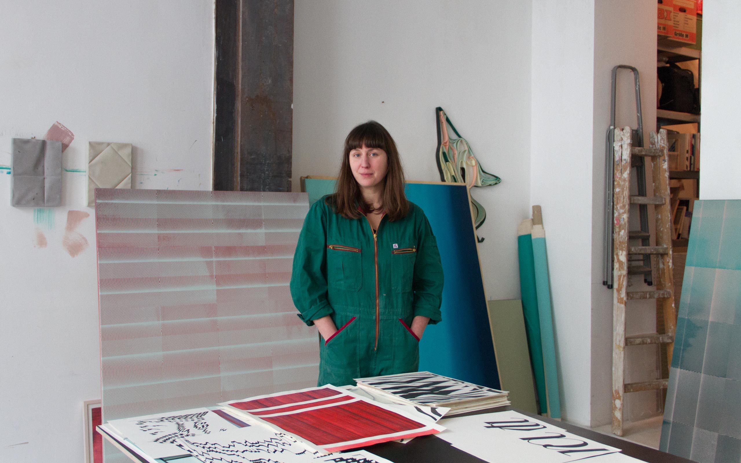
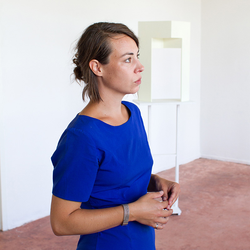
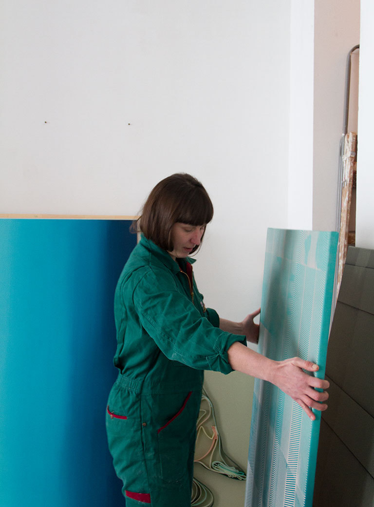
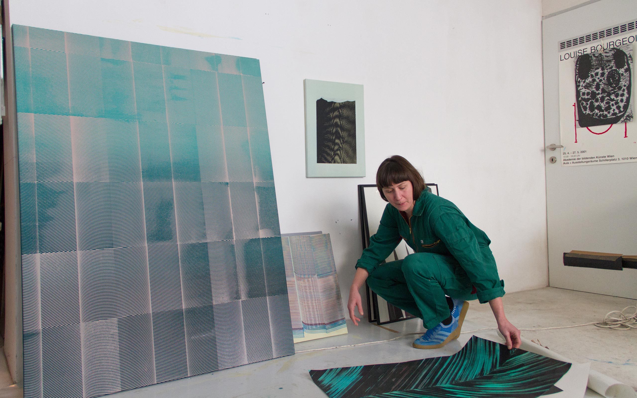
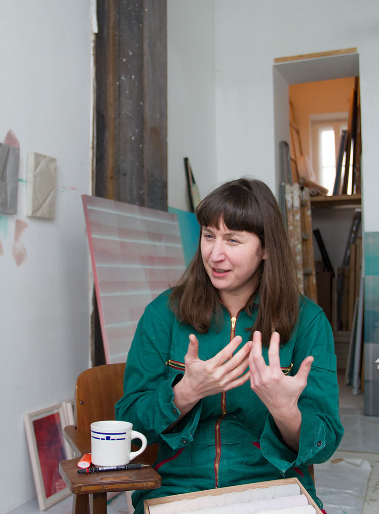
Theresa Eipeldauer’s works with their soft color gradation and strongly contrasting patterns are the result of an intensive examination of the techniques of graphic art and painting. Her motifs are positioned between brush strokes, interacting patterns, and typographic lines. In her studio, a transformed store in Vienna’s seventh district, the artist tell us more about her path from graphic art to painting and her new sculptural projects.
Theresa, thank you for the invitation to your studio. It is impressive how much space you have. Normally you don’t work alone here, do you?
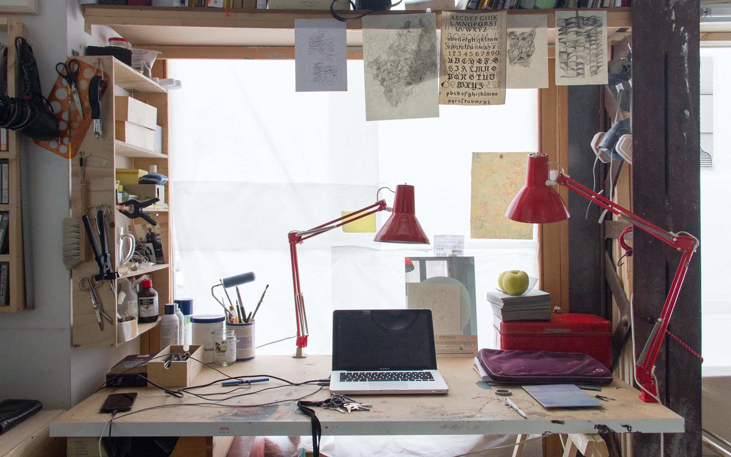
I share the studio with Sebastian Koch and Tobias Pilz. At the “Applied” too I had my studio next to Sebastian’s, we have always motivated each other. Since then, we have shared various studios; we often work in a similar direction. Now we have both moved towards painting, although we originally come from print graphics. We are still inclined to invite a third person to join us in the studio, someone who is most likely active in a very different field. I have realized that that I have a need not to be alone in the studio and to have the opportunity for exchange.
At the Academy of Applied Arts you studied with Gunter Damisch. What were your experiences of that time?
Gunter Damisch and Veronika Dirnhofer strongly supported me and strengthened my decision to study art. Although I started relatively early with drawing, I understood somewhat late that I really wanted to study art, it was therefore important to me that I felt comfortable in class. Inasmuch as the supervision was so good and that technically so much was possible, this is the reason I am now where I am.
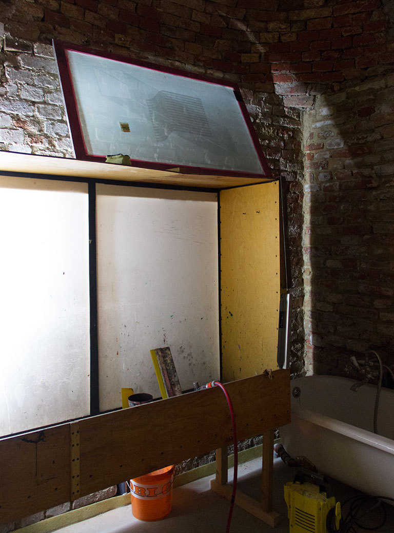
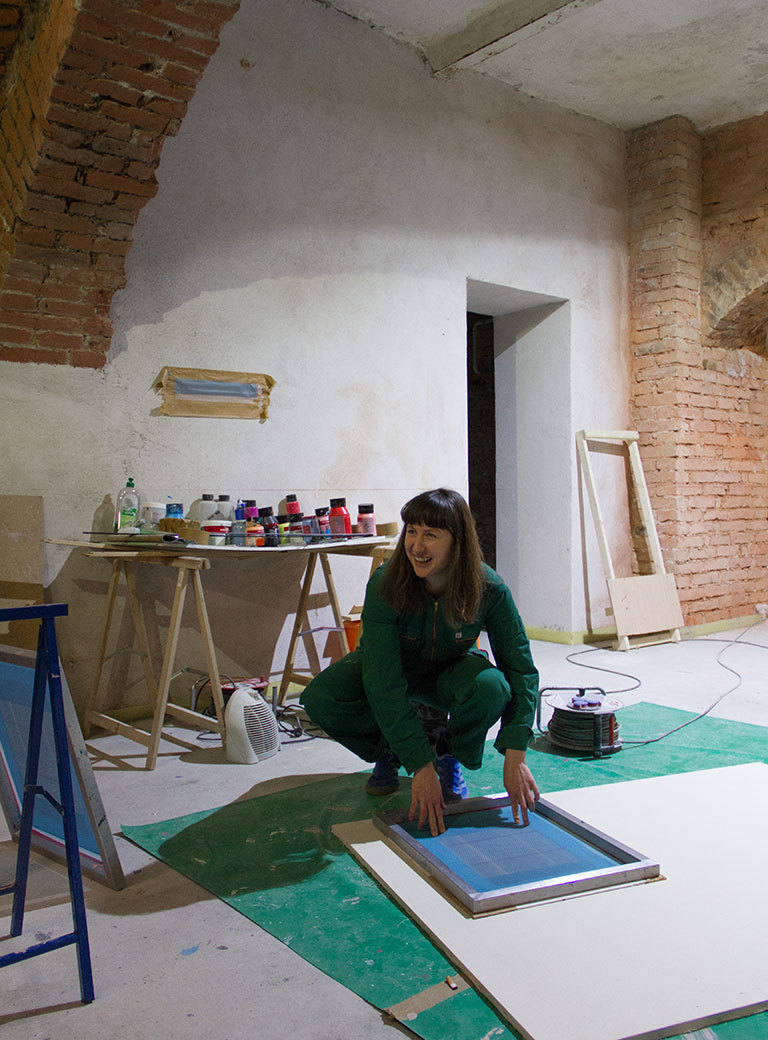
Here in the studio you even have a screen-printing shop in the basement. So you have remained true to printing graphics. What meaning does printing have in your work?
The print shop is one of the rooms that we use together. At the moment, I have monopolized the shop a bit. (Laughs) Screen-printing is a very important medium for me. I have developed towards printing from drawing by beginning to distill from my figurative drawings what interests me – surfaces and lines, forms and colors. I became increasingly more abstract and had eventually reduced everything to a single line. I standardized this line and copied it, either by drawing it with a ruler or by screen-printing it. This way I am trying to achieve various results with one and the same motif.
And what was your relationship with the technical side of print graphics?
Printing shops that still produce prints for artists have always fascinated me. Therefore I studied in a lithography shop at the ENSBA in Paris. For a long time, it had been my plan to open my own print shop, but I noticed very quickly that my own work is more important.
The development from the line to the motif and from there to repetition and pattern permeates your work like a red thread. It still revolves around print graphics.
In this context my time in Paris was very important to me. The moment of reduction that you described has taken place there. Departing from this system I have further developed my work by means of screen-printing. I am interested in how to create new spaces through the expansion and repetition of a line, although a certain line for example originates from a typeface.
Does it mean that when you set a brushstroke as a painter you still understand it as a graphic line?
I have always asked myself when does the individualization of the line begin. Language and typeface are a good example: When does the repetitive drawing of types begin to be standardized? And when is it an individual line? Coming from the graphic arts I have always admired painters, I’ve almost envied them. But expressive painting has not made sense for me. I wouldn’t call myself a painter yet, but rather a graphic artist who is approaching painting by using print graphics as the painterly medium.
How did you manage to combine your painterly and graphic interests?
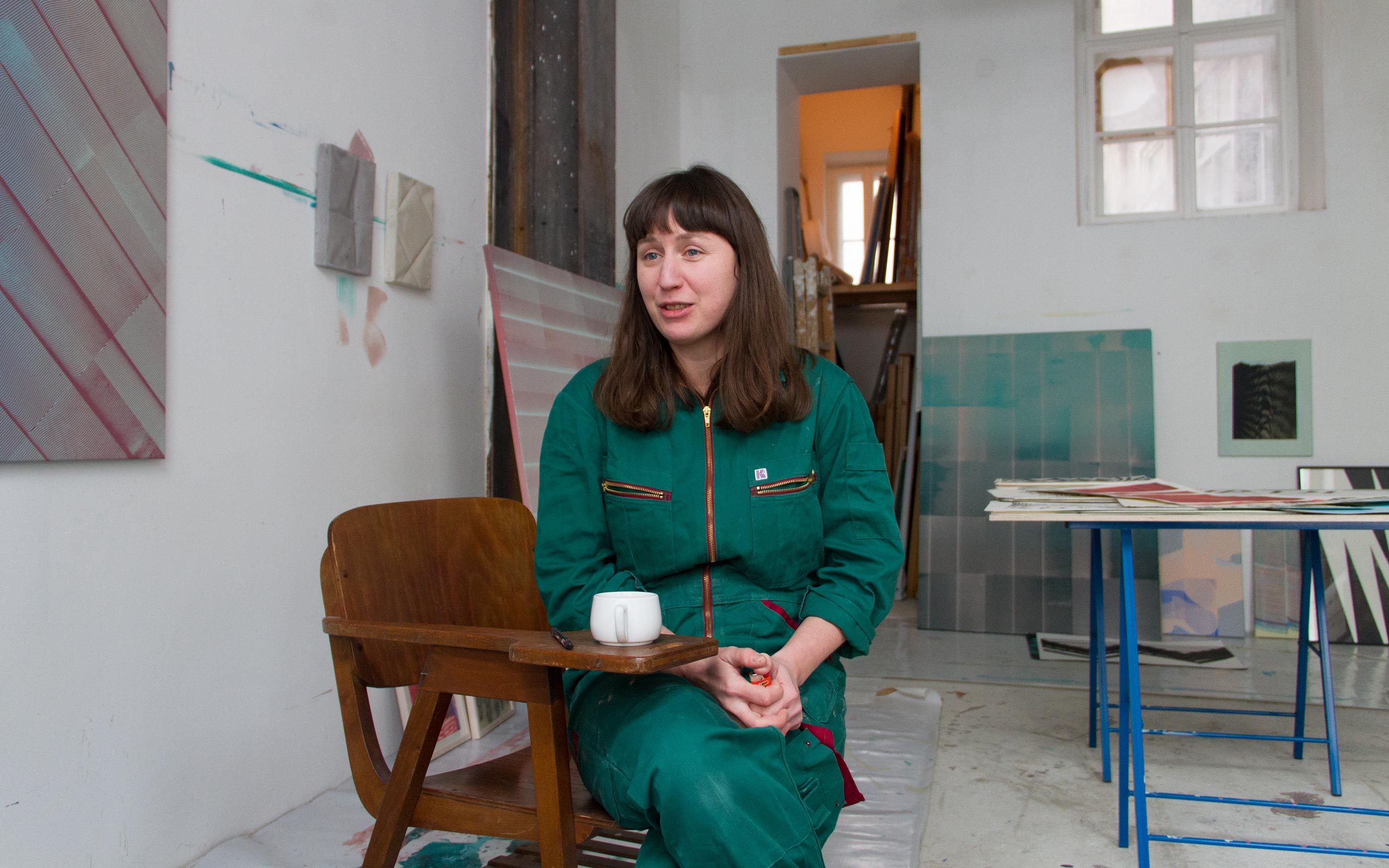
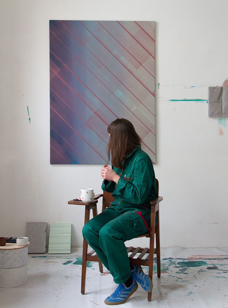
In the meantime, I have found a way to use painting most coherently. The first step is priming a canvas with a color gradient. For me this transition of one color into another is the most minimal painterly element and equivalent to the graphic element of the line that also moves from A to B. In order to realize my graphic principle, I superimpose the primed canvas with motifs. For me it is like a huge synthesis where I can control and correlate these two elements.
Does it mean that in your work there is no disruption between the graphic and painterly action?
My approach to painting doesn’t happen in one step, but is a continuous back and forth. I synchronize constantly where I am comfortable and what I can exhaust, and in that process move back and forth. For example, I am now working on things that I was already working on in 2013. This way I can repeat and newly explore certain systematic approaches that I have worked on in graphic art.
Initially your works appear very precise through their strict graphic design. Does the painterly element not mean the giving up of this precision?
That is exactly what I am interested in. I often hear “Why are there spots?” or “Why does this pull out?” In retrospect I could correct these technical imperfections. But I actually like when the work starts to crumble. For me my works gain a painterly quality when the graphic motifs start to disintegrate and are not as perfect as from the plotter. I work with printing in a way that creates organic results.
Have you felt limitations in graphic art that made you turn to painting?
There are qualities in painting that printing doesn’t have. Combining the graphic and painterly approach makes more sense to me in trying to realize everything graphically. In combination an incredible number of results can be achieved. I have the feeling that I am just beginning to explore the possibilities.
What is essentially at issue in your works?
To generate meaning by repetition! I have three files filled with scribblings, lists, and news for people. They often serve as a pool from which I select new forms that interest me. Through superimposition and recombination of the same elements, which can be clippings from script or drawings, I try to generate various graphic elements and meanings. It is like language for me. In the meantime, it is not just about levels of meaning but also about new spaces that can be opened up this way.
In your pictures you are not only pursuing the principle of creating spaces, you also pursue sculptural work.
Already in 2013, I had made spatial works in which I examined the topic of image carrier. I was focused on bringing the pictures out of their frames and to investigate how they change when one walks around them. For example, I have placed printed papers in their original storage tubes as sculptures in space. A short while ago, I made a sculpture from concrete modules oriented on the form of a Japanese torii for the sculpture park of a collector couple. In this case it was my intention that one is able to really touch the sculptures, that one has to turn around on one’s own axis in order to walk through them and that the viewers integrate themselves into my work.
And how do your present sculptural works correspond with the rest of your oeuvre?
As with my pictures, my sculptural works derive from the line. I have started to fold painted canvases, to break them, and to actually destroy them. Through the fact that I exhaust the material I am in the position to draw lines in a new way and to become graphical on a basis that derives from painting. On this basis the works made of concrete that I mentioned before have emerged. I find it interesting that the space generates painterly processes and sharp, graphic lines through light. The image derives essentially through the light.
What is at issue when someone looks at your work. Is there something that this person ideally should understand or feel?
Perhaps it is about the few seconds in which a work attracts the viewers by captivating them emotionally or by its content. That is the feeling that guides me when I walk through an exhibition. But I don’t really know how that works.
Lately, what were exhibitions in which you have experienced such a moment regarding the art shown?
Very early on, I experienced experienced such a moment in front of paintings by Mark Rothko. That was right at the beginning of my studies and the first time that I have seen real works. I was fascinated by the glowing brilliance of the paintings. This ‘real’ meeting has excited me completely and I thought I wanted to trigger something like that. I also love the paintings by Svenja Deiniger, Anne Neukamp, Tauba Auerbach, and Christopher Wool. The Matt Mullican exhibition in Winterthur, Theaster Gates in Bregenz, Malte Bruns in the KIT Düsseldorf, and R.H. Quaytman in the Viennese Secession have impressed me.
Can you reveal what will be the next developments in your work?
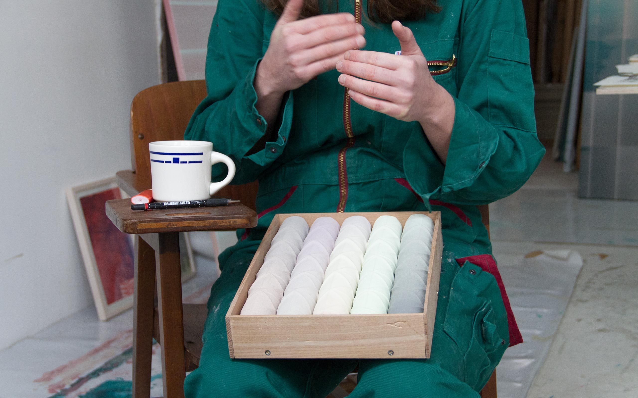
I think the next step will be to work more with light and sculpture. Recently, I produced a photo strip for the Quartheft für Kultur in which I showed my sculptures with the foldings and levels heightened by directed light in complimentary colors. For me this kind of staging was a consequential continuation of my sprayings-on-canvas works. At the moment I try to deploy graphic and painting. Another thing that interests me is to navigate the perception of a sculpture with the help of light.
Interview: Gabriel Roland
Photos: Florian Langhammer


