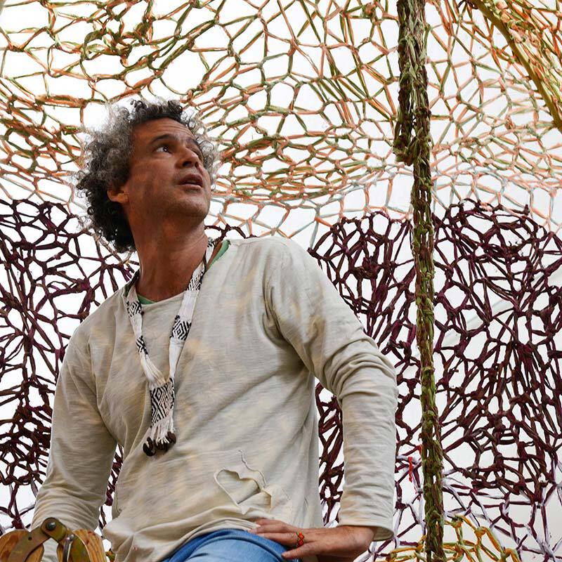
The scene for contemporary art in Europe’s North is expanding and developing new dynamics as international collectors are watching the scene. With Nordic Notes we regularly cast the eye on the Nordic art and cultural scene, portraying its important actors.
A clash between the delicate and the brutal, the vulnerable and the unrestrainable. Danish artist Tove Storch employs unconventional materials, such as body soap, to test the boundaries of sculpture while simultaneously challenging gender stereotypes. One does not require an extensive knowledge of art history to grasp the essence of her work. The key lies in experiencing her art through a sensory and embodied perspective, allowing for a deeper understanding of both her creations and the world around us.
Tove, do you remember what was the first tactile encounter you think influenced you as an artist?
I can vividly recall the specific feeling of a particular fabric; it could have been a towel. This memory tends to resurface when I enter a pre-sleep or otherwise drifting half-conscious state. It feels like it could be one of my earliest memories. Another example that comes to mind is of me looking at art when I was around 11-12 years old. I remember myself walking through an installation in a museum and thinking, “I understand the intention here. The aim is to completely immerse me in this yellow color. However, I find myself focusing on the screws and the scent of fresh paint.” Even at that young age, I felt that this is not the right way to trick the senses because this artwork was trying to be too overwhelming. I remember that thing and that it kind of made me want to be displaced into another feeling or space.
It led you to what you’re doing now. How would you characterize the type of art you create?
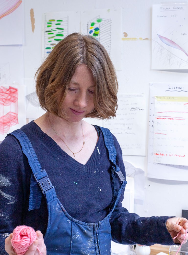
I would say my work is dealing with the obvious things that happen to physical material. For example, you take a thread. If it’s not straightened, it sags. This shape-making is actually the core of my work at the moment. I use it to talk about senses. I’m looking very much at what the body does, when I use cloth, or clay, and all kinds of things, and these things react to physical laws, including gravity. And through that, I look at the body, and all the senses that are happening the whole time. At the moment, I’m working a lot with the concept of adjusting – how something soft can adjust to something else. Hard material can soften under heavy weight, core structures can bend and collapse when subject to pressure. I use these images of dependence to grasp human relations, empathy, care, love, violence.
Often, you combine coarse materials or massive structures with light, fragile textures, for example metal and silk. Where does this inclination come from?
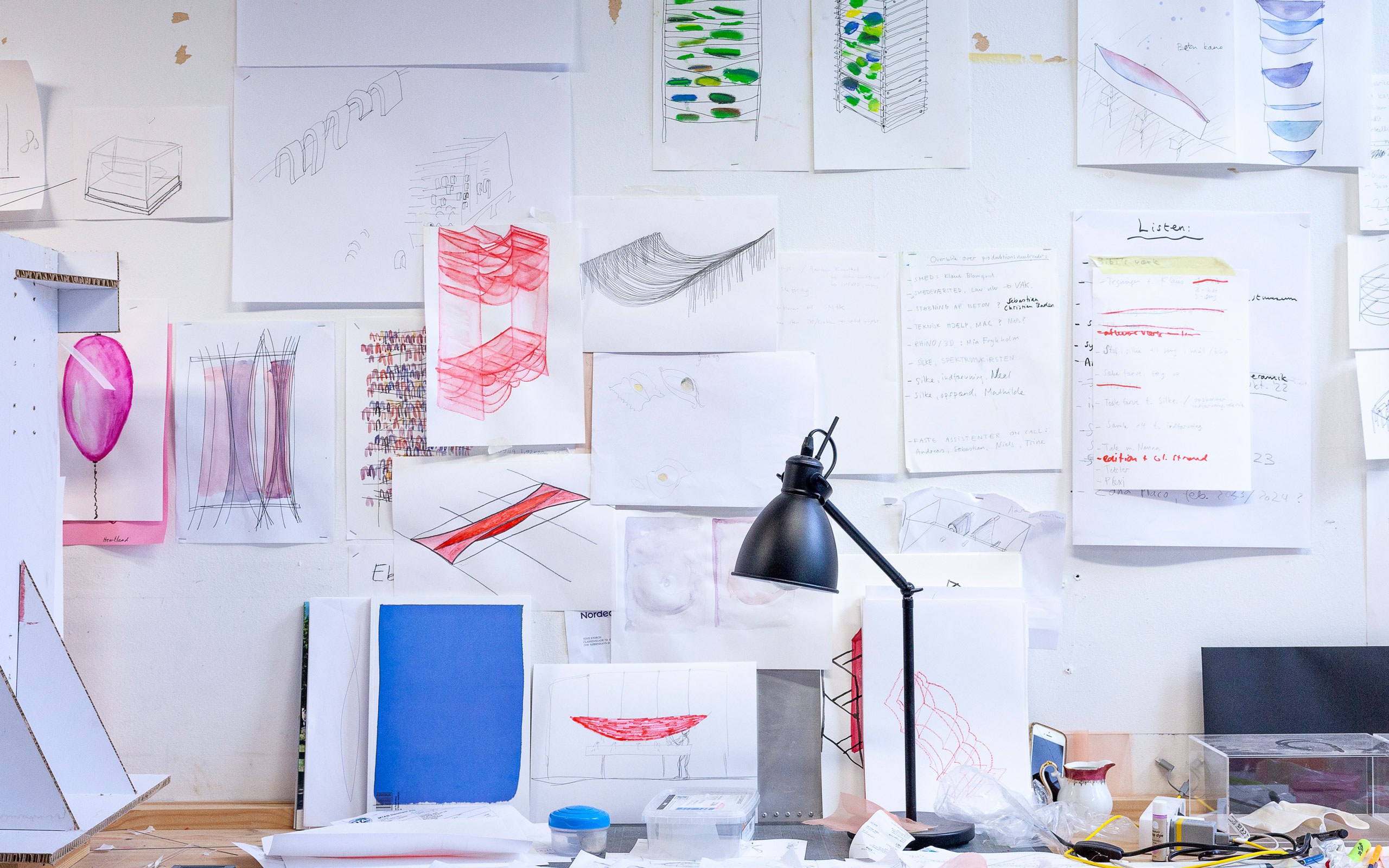
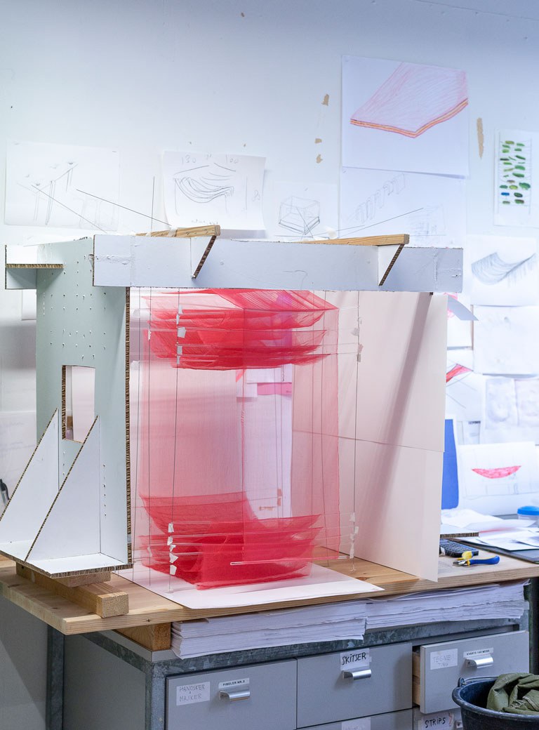
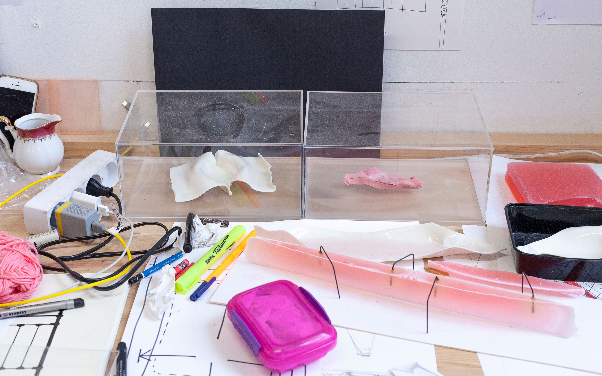
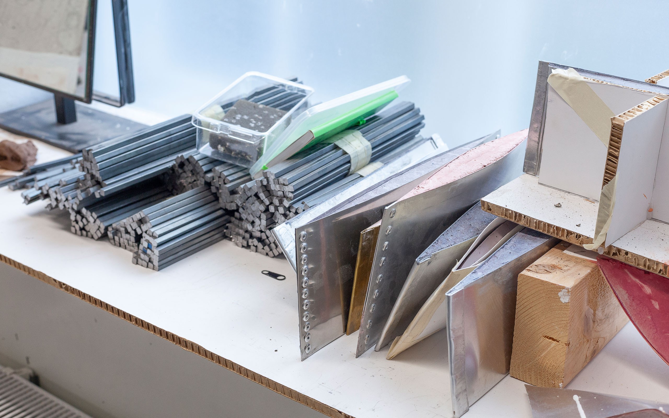
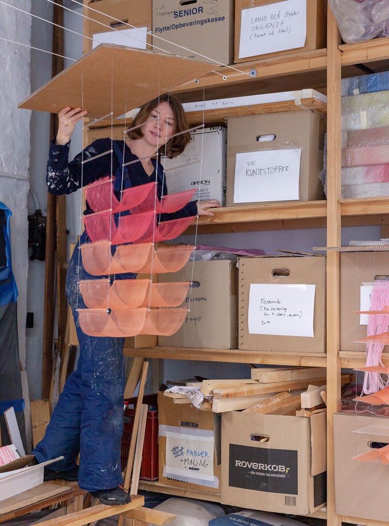
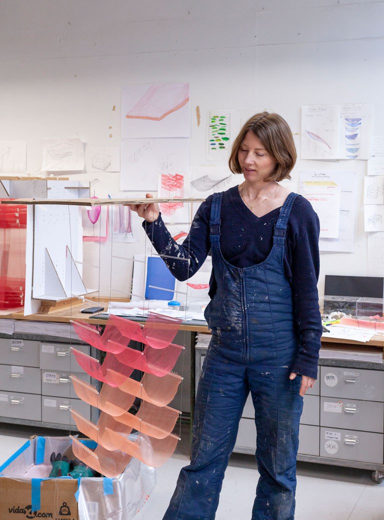
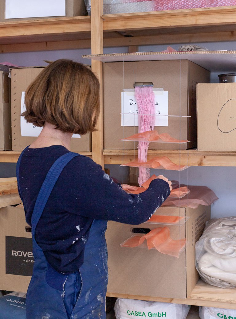
For many years, I have worked extensively with silk stretching techniques. I intentionally juxtapose materials that embody femininity with those that embody masculinity, resulting in a constant clash. I specifically utilize a unique type of silk that bears little resemblance to traditional silk, it looks like a flexible form of plexiglass. I really wanted to go around everything high tech and make a huge volume with very simple means and very simple muscle force. It’s important for me, as I am a busy woman taking care of a child and do not have an assistant, furthermore, I am not physically strong. These factors heavily influence the parameters I set for creating sculptures. The shape makings I do are informed by my way of living and I want it to be visible to people. Using cloth, I can stretch it around and then build a huge tower out of it. That is kind of my strategy.
What project are you currently working on? I noticed a piece in your workroom that bears a resemblance to a ship.
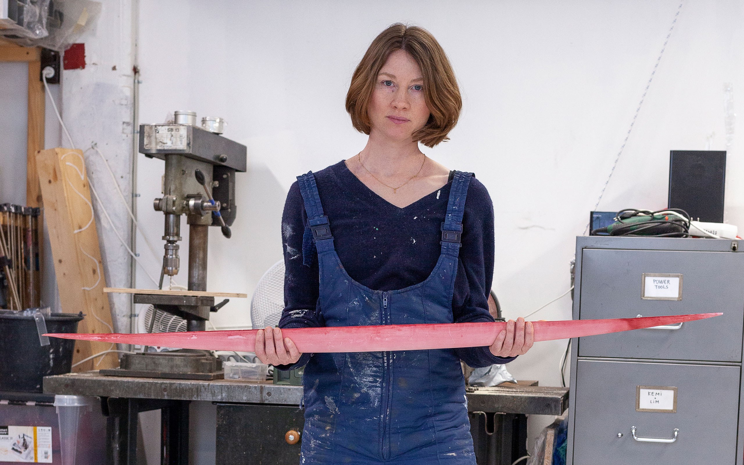
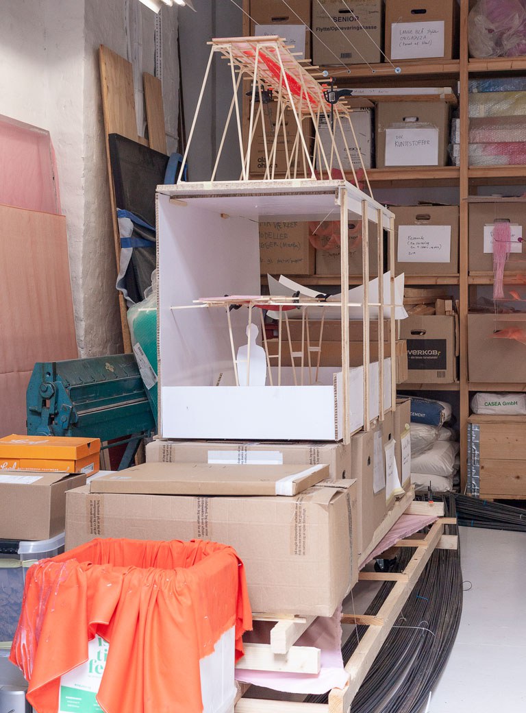
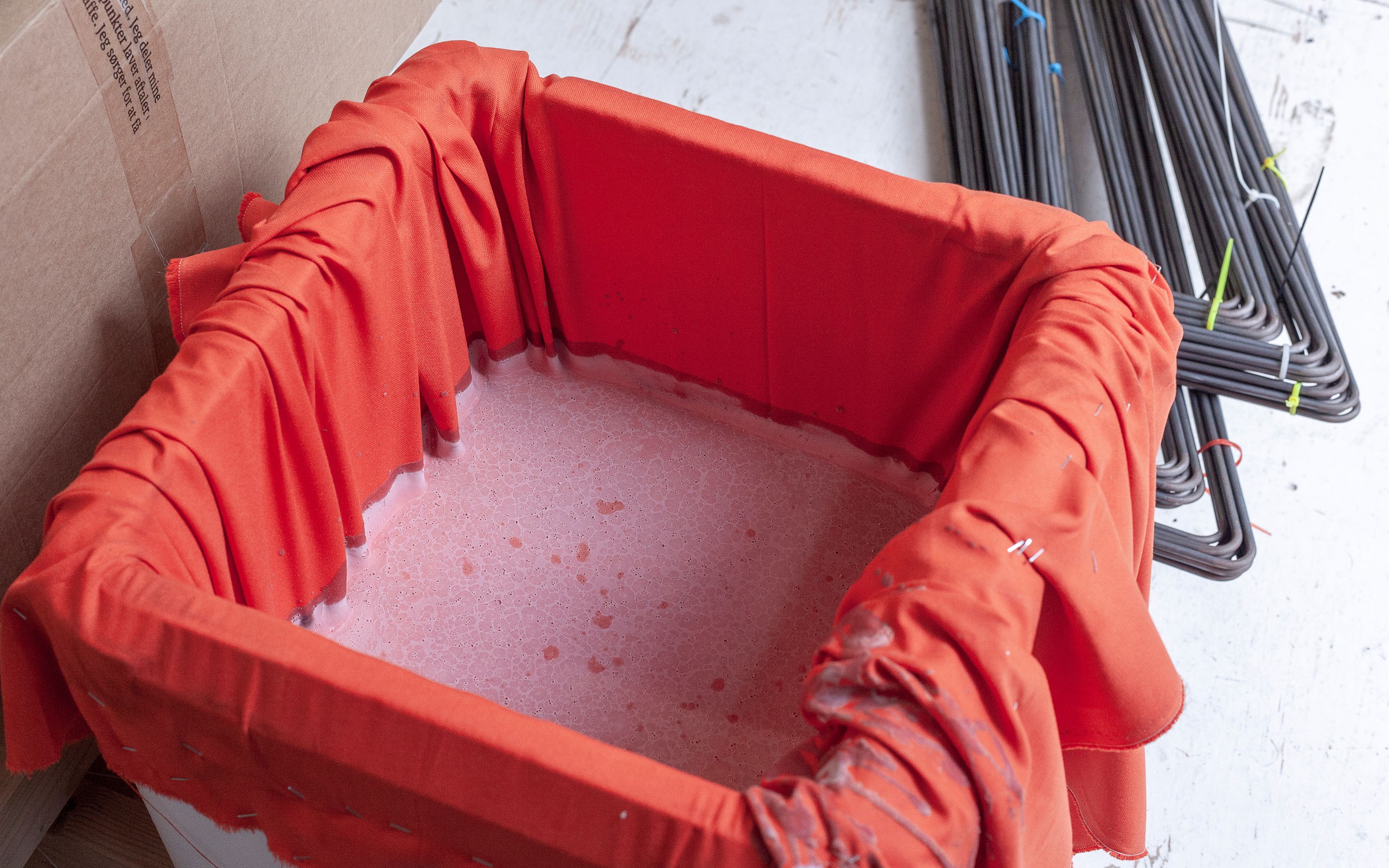
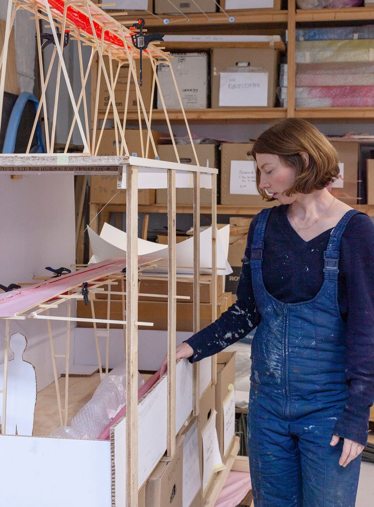
This wooden frame with canvas on used to be a straight square, like a painting lying flat, but when I pour liquid soap onto the fabric that is stretched on the frame, the fabric causes the liquid-heavy material to hang like a huge organic drop like a body in a hammock. It appears as a hanging boat, resembling both a canoe and swollen body parts. I find it powerful how viewing this shape from a different perspective can transform it into a strong feminine image. These shapes naturally form when I deviate from the traditional methods of casting. I find this exploration intriguing because many traditional crafts are often linked to masculinity but textiles, for example, are typically associated with femininity. However, textiles are just as structured as any other craft. Weaving is mathematical, it’s coding. Patterns are intricately designed and organized on a grid, primarily consisting of straight lines. Despite this, the softness of the material contributes to its association with femininity, to softness. All of these things I am mashing up together.
When are you planning on presenting them?
It is going to be shown in my solo exhibition at Kunstforeningen Gl Strand in Copenhagen in February–May 2024. What’s interesting is that it’s an old apartment building. I am currently testing all the works, but I plan to create them all inside the rooms of the apartment, because the doors in the building are too small to accommodate the completed works. I want to make it look like the works grew inside the space, which is actually the case, ultimately preventing their removal. I will cast the boat made of soap that looks like concrete, inside the exhibition space, hanging from the ceiling. Another model involves silk hanging over bars like soft bows in layers. It is constructed in a way similar to the bed of a queen surrounded by extensive drapery. Both silk and soap won’t be recognizable – you can understand it only when you’re physically present.
That’s what I’m really into – the work unfolding in real life, where you spend time and may lose track a little bit, becoming slightly confused about what you’re looking at. This way, I also challenge the notion of sculpture in general because when we see a sculpture, we usually know what it was made from without needing to read the accompanying text.
Speaking of the accompanying text. Why do most of your artworks have no title? Or actually they are called Untitled.
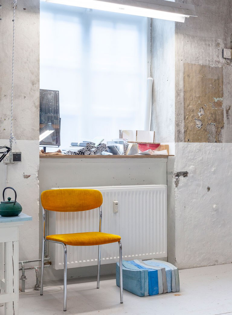
The reason for not giving titles to my works is a small act of rebellion against the rules. I don’t think I’m good at creating titles, but also it is not a significant aspect of the creative process or where my focus and interest lie. Ultimately, the requirement for titles is merely a decision made by someone else. It’s like why should I put some titles there just because other artists do. In my mind it’s not even called untitled; I’d prefer to emphasize the materials used in the artwork. It’s akin to the specificity of filling out all the little boxes when providing an address. I strongly believe that creating physical works is a language, and it’s my language.
One of your performances in 2012 actually had the title Reading Blue, where thirty-six people turn twenty pages of books containing many shades of blue. It is exploring the materiality and tactility of the color blue. How did you come up with this idea?
I’m absolutely terrified to be in front of people myself. My first decision was that it is not going to be me who will do it, but performers. When I got the invitation to do a performance, I was in the middle of doing these books in a print workshop where I had a residency. It was so interesting for me to learn the workshop protocol, the way in which you are supposed to use the different techniques. For example, for silkscreen printing you make a screen with a motif. Then you press the color through the screen and you get your text or your image. This can be repeated to generate multiple identical images. For this performance I decided I don’t need anything to be the same. I like printmaking because it has to do with pressing something onto another. I just used paint and a rubber squeegee straight onto paper. Each print was a unique image because it was an individual scrape. Then I made each book also in one color and then I was just slightly changing it. There was nothing technical. I could just decide if it’s enough of this blue. I’m going to make another print with blue and add a little bit of yellow, then black; each time there is the addition of just one blob of color. Then looking at the color, I could decide how close it is to what for example I achieved ten prints previously, or to what extent it’s different. It’s kind of a case of adjusting the eye. And it’s a real painter’s way of thinking or state of mind. Even though I am not really a painter.
Your art tends to be very colorful. Do you deliberately avoid dark patterns?
It’s about time periods and obsessions. From the pink era I am moving into the red era. It’s also a freedom that I decided I have to be spending a lot of time focusing on one thing. For years I’ve been focused on blue, and everybody thought that I constantly work with that color, but I just go deep into this hole, and later I go deep into another. It can take years, but I take the freedom to be slow. The whole pink period was connected to expanding the idea of sensing the body, sexuality and femininity. That’s why I choose such colors so there would be no doubt. I take these colors from the shape making of the Feminist symbols.
Has the experience of motherhood influenced your artistic development?
Yes, I think it has. Basically, I was hit by reality on entering motherhood, the experience of inequality, the forces within my body out of my own control, roughness, wildness, living through an experience I have heard of so many times but never understood firsthand. I have wanted to give all of this some kind of language, to capture it within something that I can return to and feel recognized. In my work I have always enjoyed organizing and structuring elements, maintaining a sense of control over everything, predicting tilts and collapses and points of balance. However, this inclination towards structure has often been associated with a masculine perspective. I realized that these skills of empathy and structure, are precisely those I use in motherhood. I think this is interesting in the larger context of how creativity and femininity is portrayed in our culture.
Once you mentioned, when people attend an exhibition, it is beneficial to them to have no expectations; this approach can greatly enhance their overall experience, why do you think this is so?
I think the public does not know how to experience art exhibitions. They think: “Oh my God!” It might be so confusing and difficult, and I should be smarter to be able to enjoy the exhibition. For me it’s about learning a language and I want to take the fear out of this because it can be complicated, but it can also be super simple. Because the basis of my work does not involve a lot of research, rather it involves a lot of sensing that anyone can do with their own body and their own attention. Whatever you do, use the same degree of awareness and then you can experience something in a different way.
You’re also working with a permanent public art project in Copenhagen. Is this a new type of experience for you?
I won a competition for creating a public sculpture, and it is intended to define a neglected area in the city. It’s located near one of the main entryways to Copenhagen, which all the cars speed down before merging into the city traffic. Some might consider it a horrible location, as it is disregarded and situated on the city outskirts. However, for me it is an incredibly interesting place. This area has turned into an island. The cars look like the ocean, just flowing past, there are also extensive railway tracks leading in and out of the city. Moreover, there is a huge cemetery and a prison in the vicinity. Everywhere you look, it seems unsuitable for the human body. However, within this small triangle, there are rental houses. The aim is to draw attention to this particular area of the city, as many people are even unaware that it has a name. Therefore, I will attempt to highlight this area with my work.
What sculpture will it be?
As I am fascinated by this boat shape, this is going to be a huge red boat. As I mentioned earlier, it serves as both a female symbol and a symbol of a vehicle. It represents movement, with its to-and-fro motion, and its velocity as a ship. However, at the same time, it’s also a non-functional vessel, almost like a stationary rock. Additionally, it can be seen as a mere droplet, symbolizing fluid descending. My intention is to emphasize the force of gravity, directing it straight down into this specific moment in time, focusing on the space and the energy generated. Furthermore, we have cars moving back and forth, making it resemble a monument to traffic. Yet, at the same time remaining in one place and serving as a monument to stillness.
In your interview for the Statens Museum for Kunst 10 years ago you said: “If people really want opinions from art pieces, it will become a problem”. Did your opinion change 10 years later?
It’s not that I don’t have opinions. I have tons of them. I just don’t want my works to be illustrations. Different artists are good at different things, and I think I’m good at the poetic sensory level which is not where opinions happen. The reason why I make artworks and sculptures is because it’s often something that I’m unable to say out loud. I do not mean that art should not be political for example, not at all, I just mean that it’s not a spoken language, but a physical language, which is not the same and is what is interesting to me. In the end, I think my work is becoming more political, but this is something that is occurring at my own pace and in my own way.
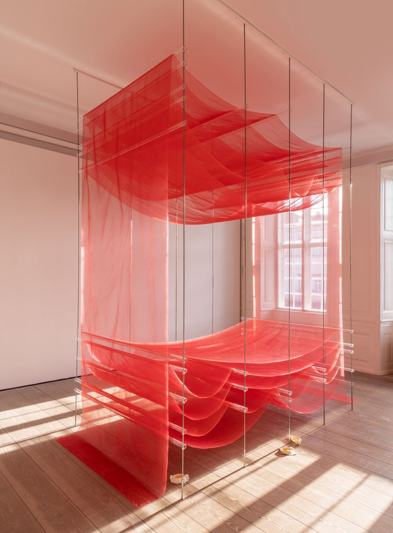
Tove Storch, Untitled, 2024 Silk, acrylic, metal, Photo: David Stjernholm
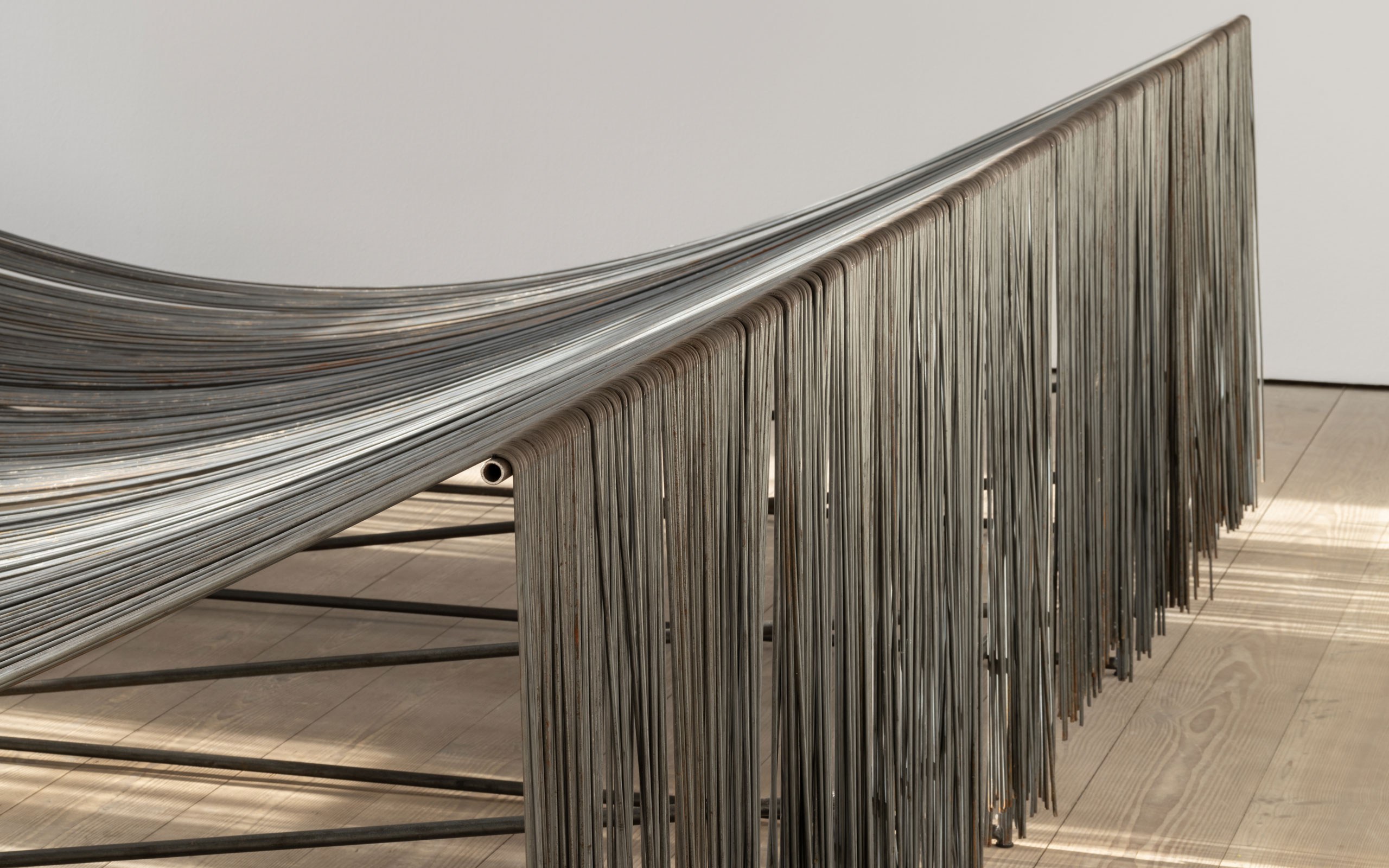
Tove Storch, Untitled, 2024, Metal, Photo: David Stjernholm
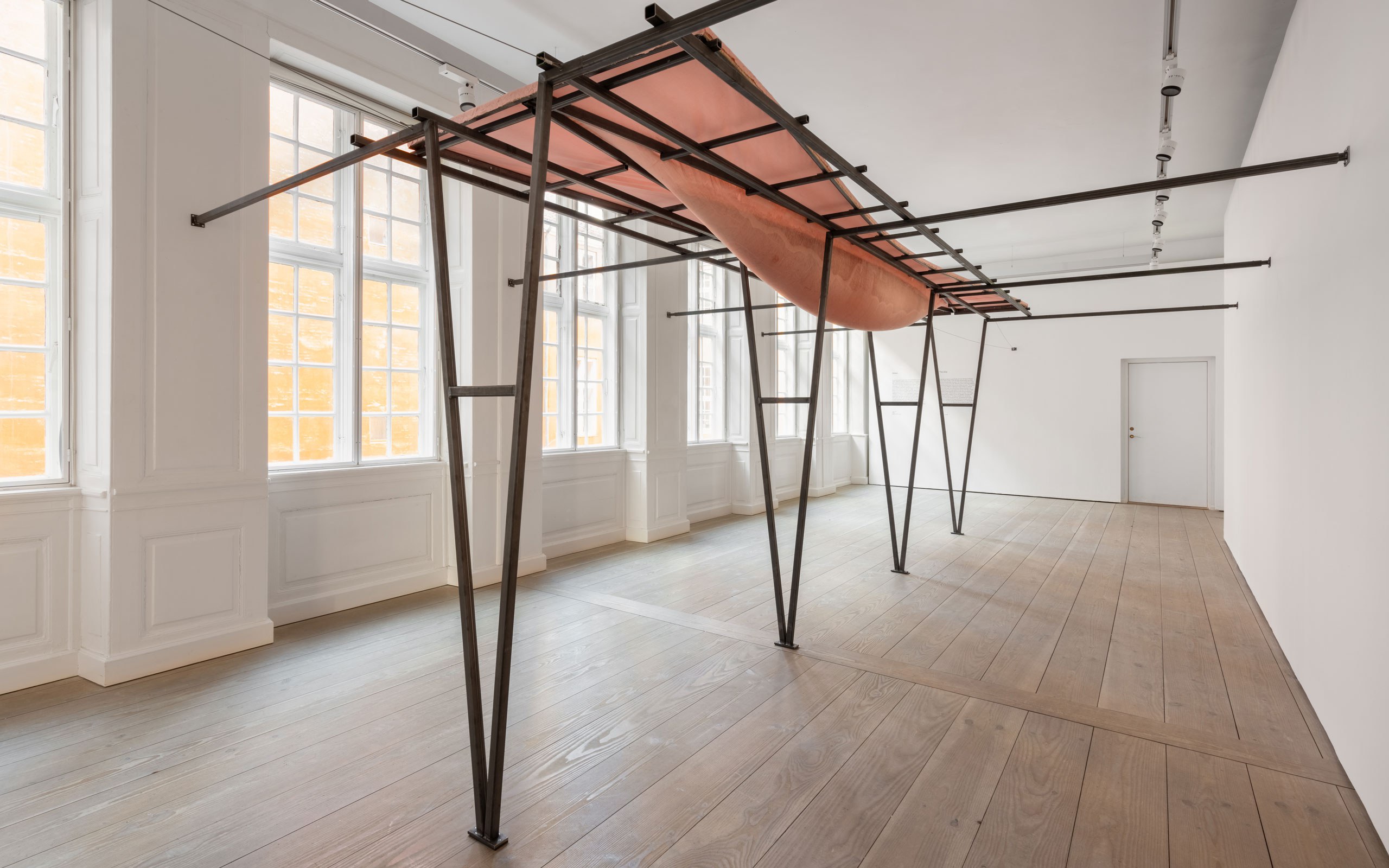
Tove Storch, Untitled, 2024, Soap, cotton, metal, Photo: David Stjernholm
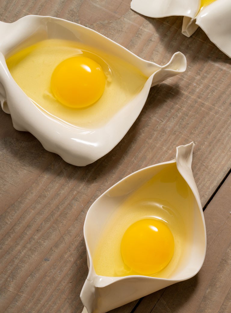
Tove Storch, Untitled, 2024, Photo: David Stjernholm
Interview: Anton Isiukov
Photos: Rebecca Krasnik


